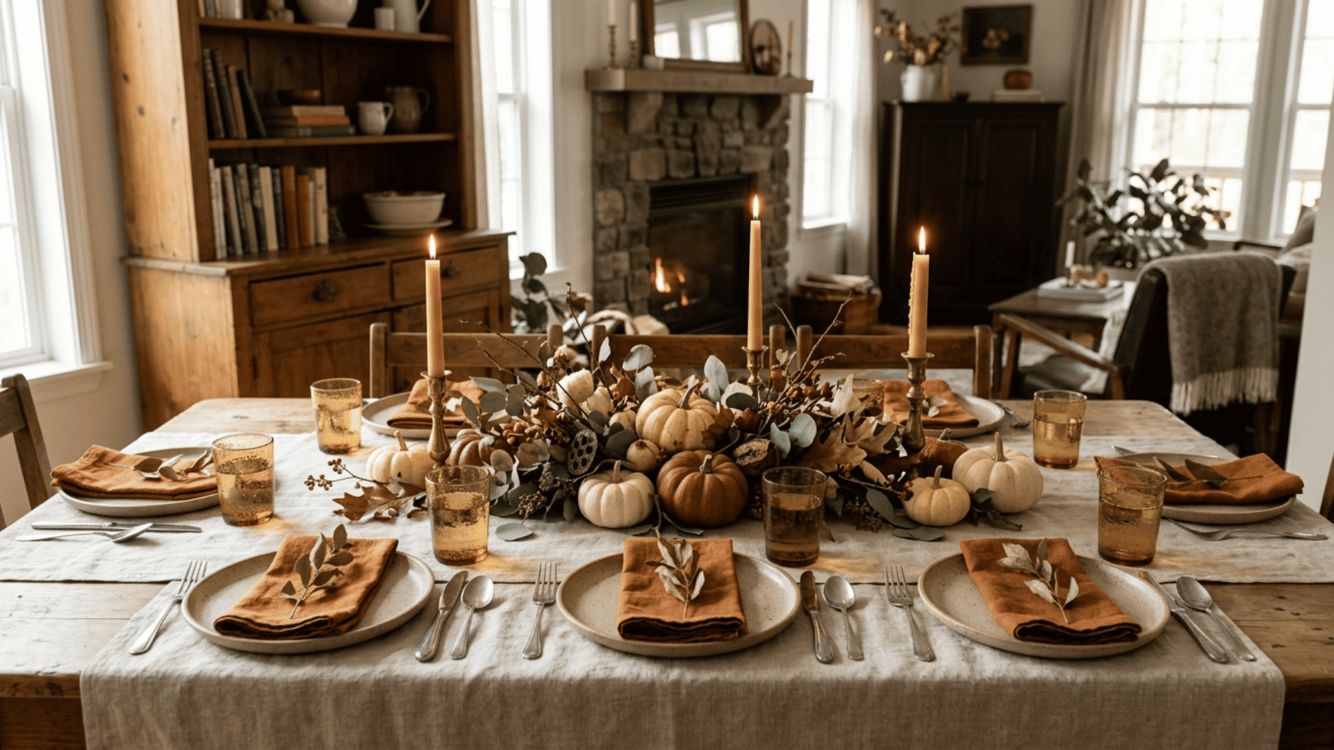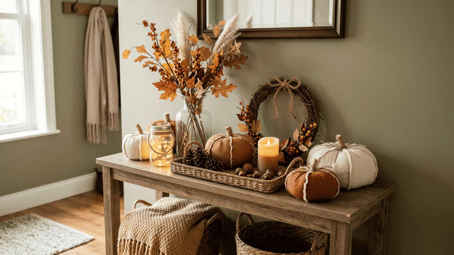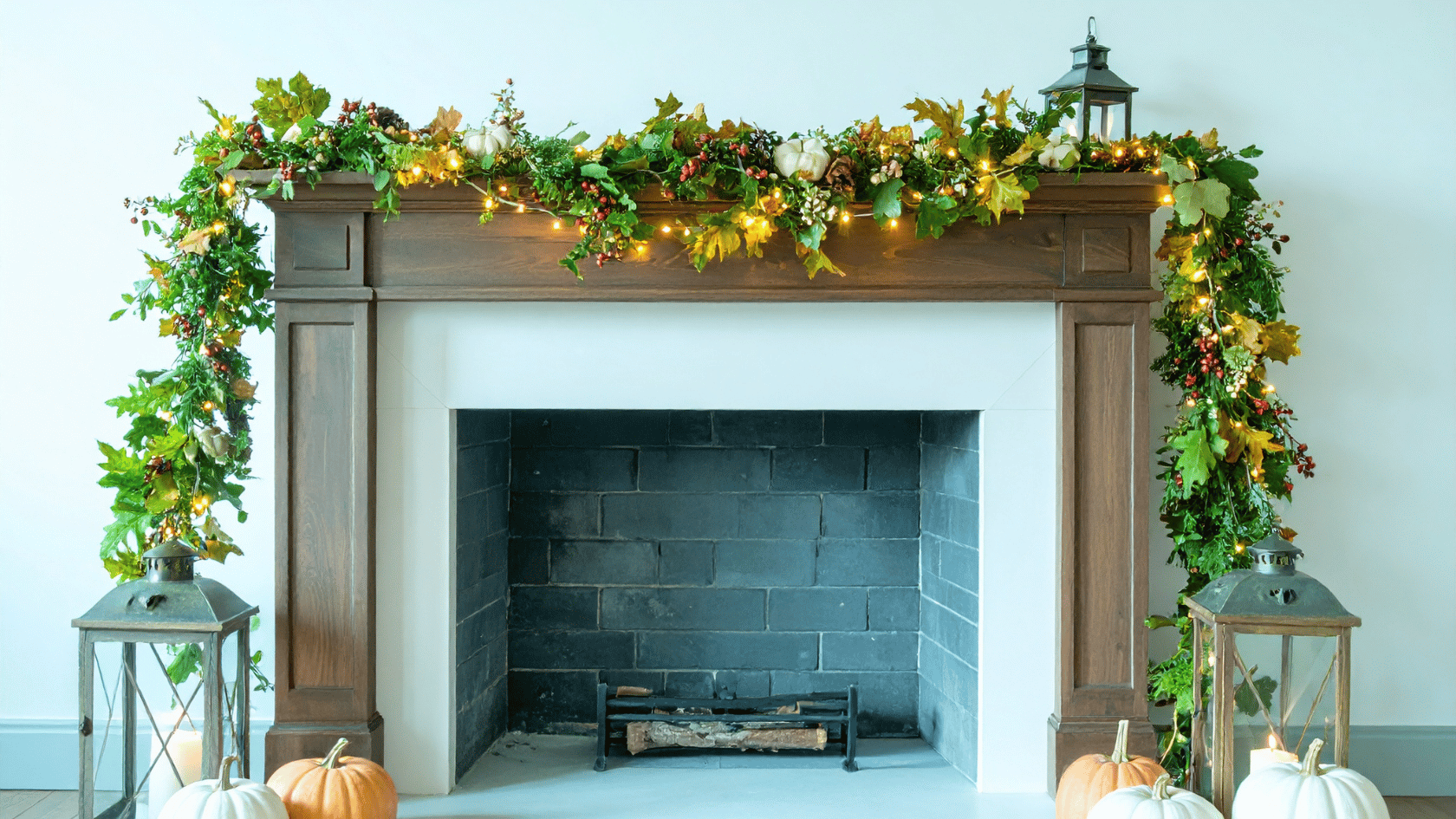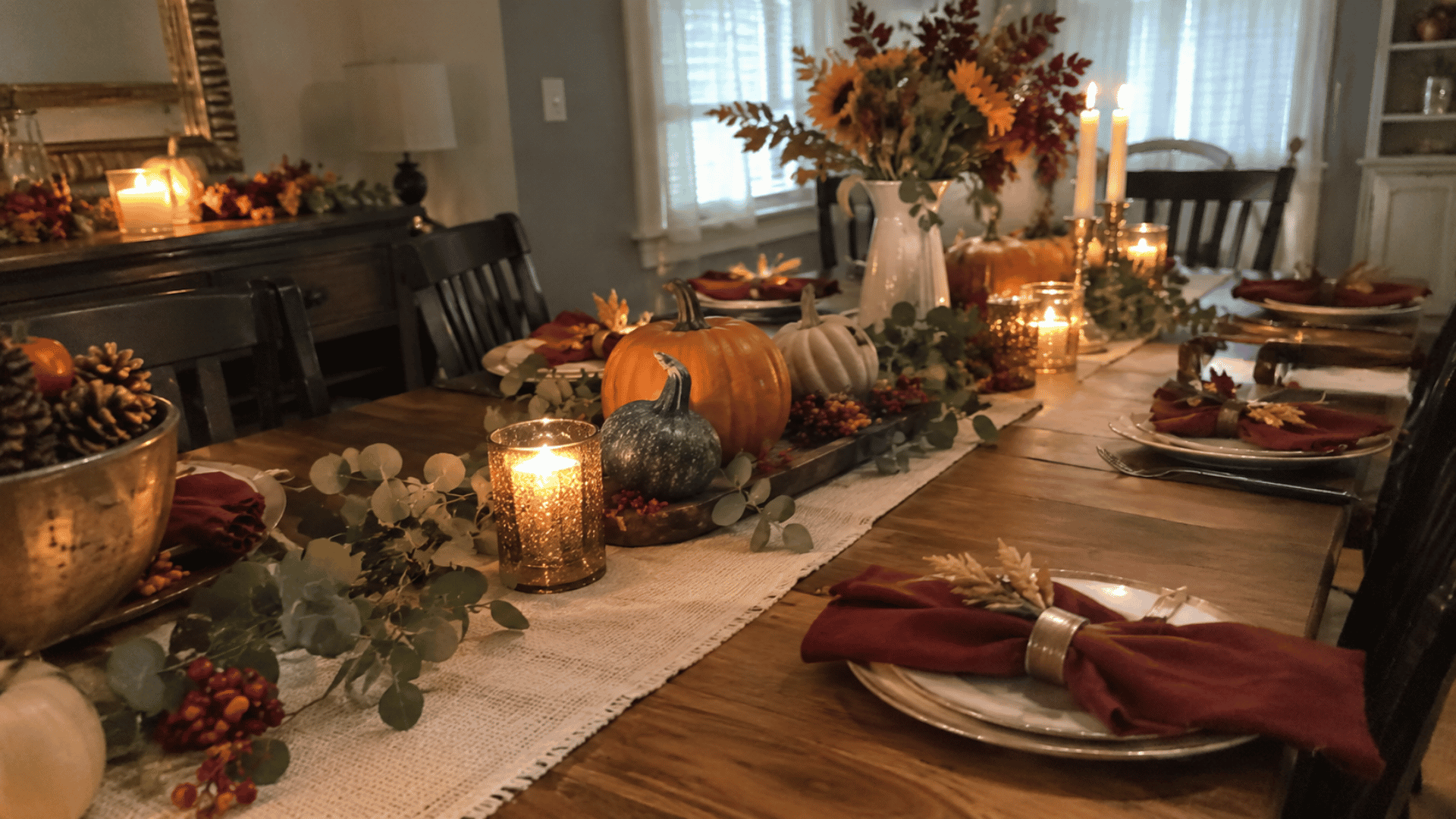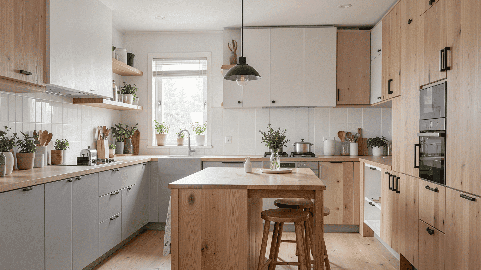

A warm fall color palette blends earthy shades like rust, terracotta, mustard, olive, camel, and cream for a rich, cozy look.
I usually balance one warm lead color with a neutral and one or two accents. The same approach works for both decor and outfits.
In color analysis, Warm Autumn also refers to a specific palette known for warm, rich, medium-to-deep tones.
Below, you’ll find swatches, ready-made combinations, wardrobe ideas, and simple ways to use these colors at home.
What Colors are in a Warm Fall Color Palette?
A warm fall color palette usually includes rust, terracotta, burnt orange, pumpkin, mustard, amber, olive, moss, forest green, camel, caramel, cream, chocolate brown, brick red, copper, and warm teal.
The common thread is not simply “fall colors.” These shades share a warm, earthy, moderately rich appearance. They lean toward golden, brown, yellow, red, and softened green undertones rather than icy, pastel, neon, or strongly blue-based colors.
What Do Warm Fall Color Swatches Look Like?

If you want a palette you can copy straight away, start by choosing colors from several families rather than filling everything with variations of orange.
Here is an easy swatch reference:
|
Color Family |
Warm Fall Shades |
|---|---|
|
Oranges |
burnt orange, pumpkin, terracotta |
|
Reds |
rust, brick red |
|
Yellows |
mustard, amber |
|
Greens |
olive, moss, forest green |
|
Neutrals |
cream, camel, caramel, chocolate brown |
|
Accents |
warm teal, copper |
You do not need to use every shade together. A balanced warm fall color palette often works better with one or two richer colors supported by warm neutrals.
For example, terracotta, cream, camel, and olive already create a complete fall combination without needing mustard, rust, and orange as well.
Which Ready-Made Warm Fall Color Palettes Can You Copy?
A good warm fall color palette does not need every classic autumn shade. Changing the balance between neutrals, greens, reds, and golden colors creates very different moods.
Here are five combinations you can use as starting points.
1. Classic Harvest

|
Burnt orange + mustard + olive + rust + cream |
|---|
This is one of the most recognizable autumn combinations. Orange and rust provide warmth, while olive prevents the palette from becoming too red or yellow. Cream gives the stronger shades somewhere to rest.
I would use this combination when I want a space or outfit to feel clearly seasonal without covering everything in pumpkin orange.
2. Earthy Neutral

|
Camel + terracotta + warm beige + caramel + chocolate brown |
|---|
Choose this palette when you want warmth without an obvious seasonal theme.
Most of the colors are neutrals, with terracotta providing just enough contrast. It works particularly well for upholstered furniture, knitwear, wood finishes, leather accessories, rugs, and other pieces you may want to use beyond autumn.
3. Woodland Fall

|
Moss green + forest green + chocolate brown + amber + cream |
|---|
Not every fall palette needs orange.
This combination takes its cues from moss, trees, bark, dried grasses, and late-season sunlight. The greens lead the palette, while amber adds warmth and cream keeps the deeper colors from becoming too heavy.
I particularly like this option when the usual orange-and-rust combinations feel too predictable.
4. Warm Terracotta

|
Terracotta + brick red + copper + camel + cream |
|---|
This palette leans toward reddish clay colors rather than classic orange.
I like this combination when a room already contains warm wood or brown leather because the terracotta and copper build naturally on those existing undertones.
Brick red adds depth, while camel and cream soften the stronger colors.
5. Deep Golden Fall

|
Mustard + forest green + rust + chocolate brown + warm teal |
|---|
This is the richest combination of the five.
Warm teal gives the palette an unexpected contrast while still working with the earthy direction. Rust and mustard bring back familiar autumn warmth, while chocolate brown anchors the combination.
Use cream or camel nearby if the deeper shades start feeling too heavy.
What is a Warm Autumn Color Palette in Color Analysis?
In seasonal color analysis, Warm Autumn describes a palette where warmth is the dominant quality.
The colors tend to be golden, earthy, moderately rich, and medium to medium-deep rather than pale, icy, or extremely bright.
Typical shades include:
- rust
- pumpkin
- terracotta
- mustard
- olive
- forest green
- camel
- cream
- chocolate brown
- warm teal
You may also see the name True Autumn when researching this palette. Terminology varies between seasonal color-analysis systems, so it is more useful to focus on the actual palette than the label alone.
The main idea remains consistent: Warm Autumn favors colors that feel golden, grounded, and earthy.
What are the Characteristics of the Warm Autumn Palette?

The easiest way to understand Warm Autumn is through four core characteristics:
- Temperature: Distinctly warm, with yellow, golden, orange, red-brown, and warm green influences rather than icy or strongly blue undertones.
- Value: Mostly medium to medium-deep. Think chocolate instead of pale gray and forest green instead of mint.
- Chroma: Rich and noticeable, but not neon-bright. Warm Autumn colors usually feel softer and less clear than Spring colors.
- Overall appearance: Golden, earthy, and grounded. Spices, autumn leaves, moss, wood, clay, copper, and warm late-afternoon light are useful visual references.
How Does Warm Autumn Compare With Similar Color Palettes?

Warm Autumn can look similar to other earthy seasonal palettes when you see just one swatch. The differences become clearer when you compare their overall direction.
|
Palette |
Main Difference |
Typical Colors |
|---|---|---|
|
Warm Autumn |
warmth leads |
rust, mustard, olive |
|
Soft Autumn |
softer and more muted |
sage, dusty terracotta, muted beige |
|
Deep Autumn |
darker overall |
chocolate, deep forest, burgundy |
|
Warm Spring |
clearer and brighter |
coral, golden yellow, fresh green |
- Soft Autumn turns down the intensity.
- Deep Autumn turns up the depth.
- Warm Spring keeps the warmth but becomes lighter and clearer.
- Warm Autumn stays firmly earthy, golden, and rich.
This comparison is useful because a single green or brown shade can appear in more than one palette. What changes is the overall level of warmth, brightness, softness, and depth.
Which Colors Work Best in a Warm Autumn Wardrobe?

A Warm Autumn wardrobe becomes much easier to build when you separate foundation colors from statement shades.
Start with warm cream, camel, khaki, chocolate brown, caramel, or olive as your main neutrals. These shades work well for trousers, coats, sweaters, bags, and other repeat-wear pieces.
Then add richer colors such as:
- rust
- terracotta
- mustard
- pumpkin
- forest green
- moss
- brick red
For smaller accents, try warm teal, amber, copper, or warm coral. Gold, bronze, copper, and antique brass also suit the same warm direction.
The useful part is that these colors already share warmth, so you can combine them without making every item match exactly.
Warm Autumn Outfit Color Combinations to Try
If a full palette feels overwhelming, start with three colors at a time:
- camel + rust + cream
- olive + chocolate brown + mustard
- terracotta + warm beige + cognac
- forest green + camel + cream
- brick red + chocolate brown + bronze
- warm teal + caramel + cream
I keep it simple: choose one main color, pair it with a neutral, and use a third color as the accent.
For example, a camel coat can carry most of an outfit while rust knitwear supplies warmth and cream provides contrast.
How Can You Use a Warm Fall Color Palette in Home Decor?

A warm fall color palette works best in a room when it supports the existing materials instead of sitting on top of them like temporary seasonal decoration.
I usually begin with whatever is hardest to change. If the room already has walnut flooring, a beige sofa, or warm wood cabinets, those colors become part of the palette.
A simple structure is:
- Base colors: cream, beige, camel, warm wood
- Secondary colors: olive, terracotta, caramel
- Accent colors: rust, mustard, copper, brick red
A combination such as cream + walnut + rust + olive is often enough.
Try stronger fall shades on pillows, throws, lamps, artwork, ceramics, or a rug before committing them to every large surface. Repeating one accent two or three times around the room usually feels more intentional than introducing a different fall color in every corner.
Which Colors do Not Naturally Fit a Warm Autumn Palette?
Cool or extremely bright shades usually sit outside the typical Warm Autumn direction.
These include:
- icy blue
- cool lavender
- cool gray
- optic white
- blue-based pink
- fuchsia
- very cool navy
- neon shades
That does not mean you have to completely avoid a favorite color.
Instead, think about proportion. A cool shade can appear in a small accessory or away from the main palette without defining the entire combination.
The main difference is that these colors introduce more coolness, brightness, or sharp contrast than Warm Autumn typically carries.
Final Say
A warm fall color palette does not need to look like a pile of autumn leaves. What matters is the relationship between the colors: golden warmth, earthy depth, and enough softness to keep the combination grounded.
We covered the main swatches, ready-made combinations, Warm Autumn characteristics, wardrobe colors, and ways to bring the same palette into a room.
If you want an easy starting point, choose one neutral such as cream or camel, pair it with an earthy shade like rust or olive, then add one richer accent.
Which fall color mix do you like most? Comment below.
Frequently Asked Questions
Is Warm Autumn the Same as True Autumn?
Often, yes. Some seasonal color systems use the names interchangeably, while others separate Warm Autumn and True Autumn into slightly different palettes.
Can Blue Be Part of a Warm Autumn Palette?
Yes. Warm teal, peacock, and blue-green shades usually fit more naturally than icy, pastel, or strongly cool blues.
Does a Warm Fall Palette Have to Include Orange?
No. Olive, camel, cream, chocolate, mustard, rust, warm teal, and moss can create a recognizable warm fall color palette without making orange the main shade.