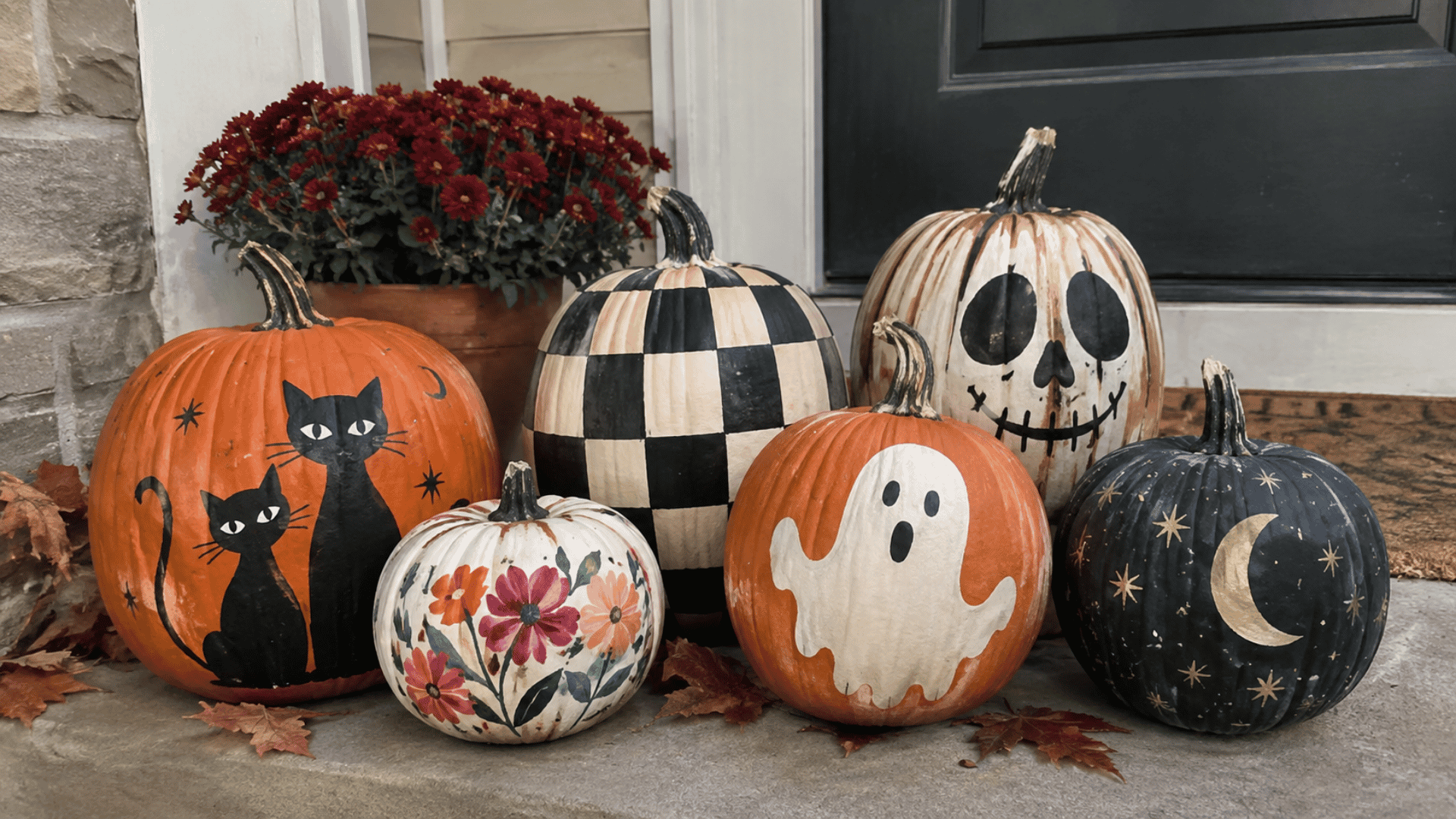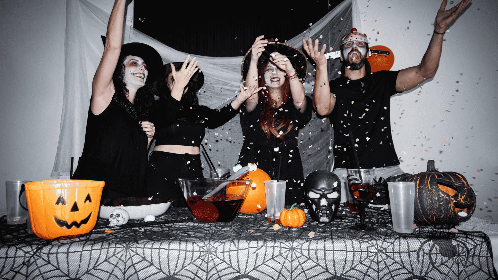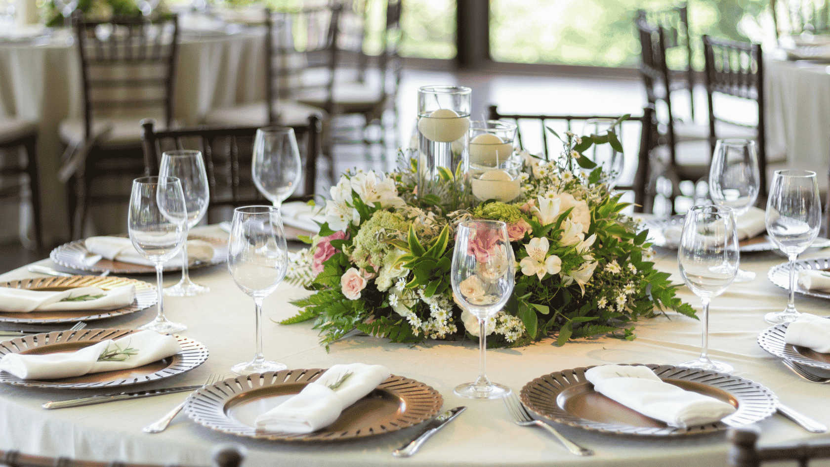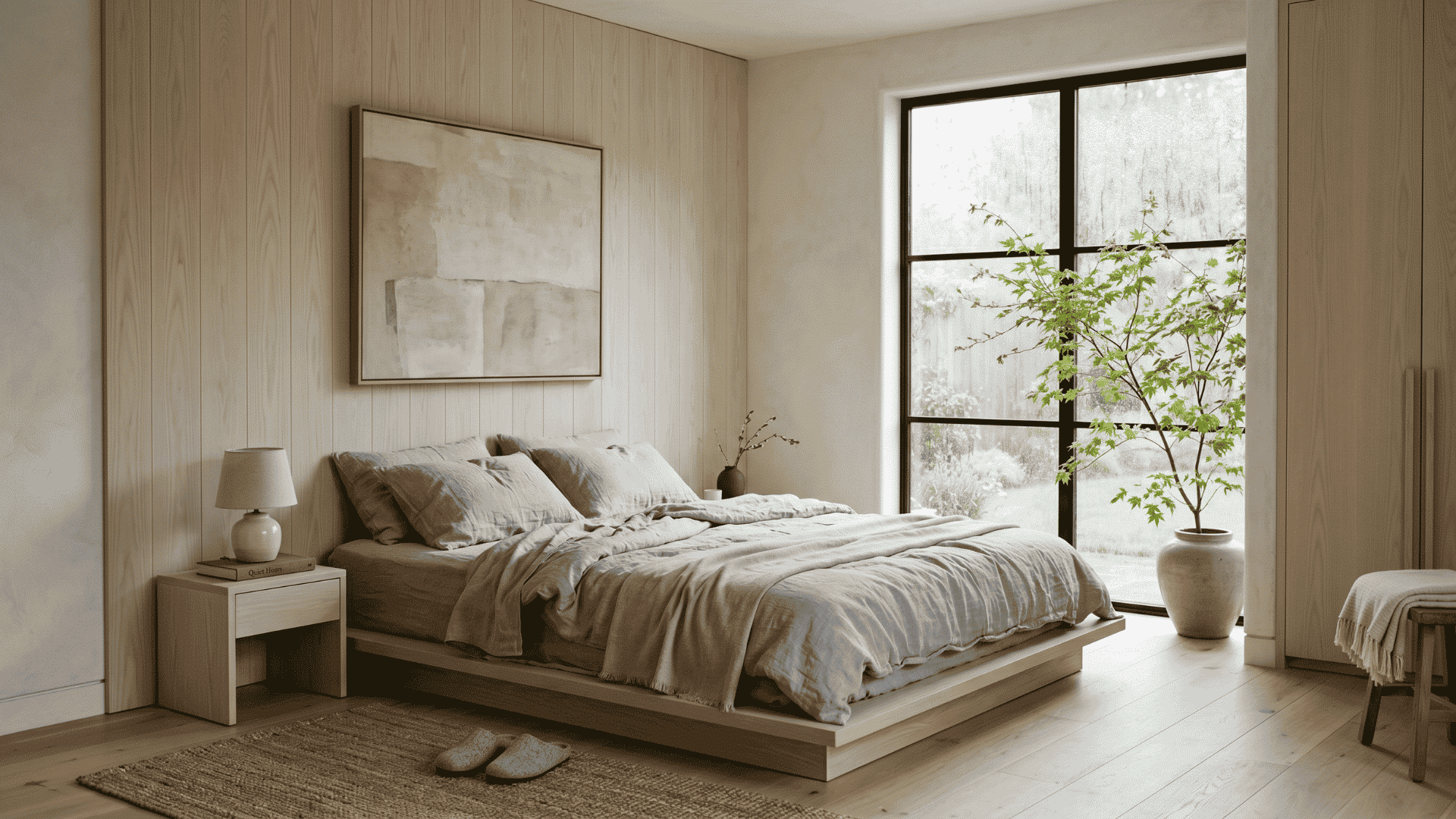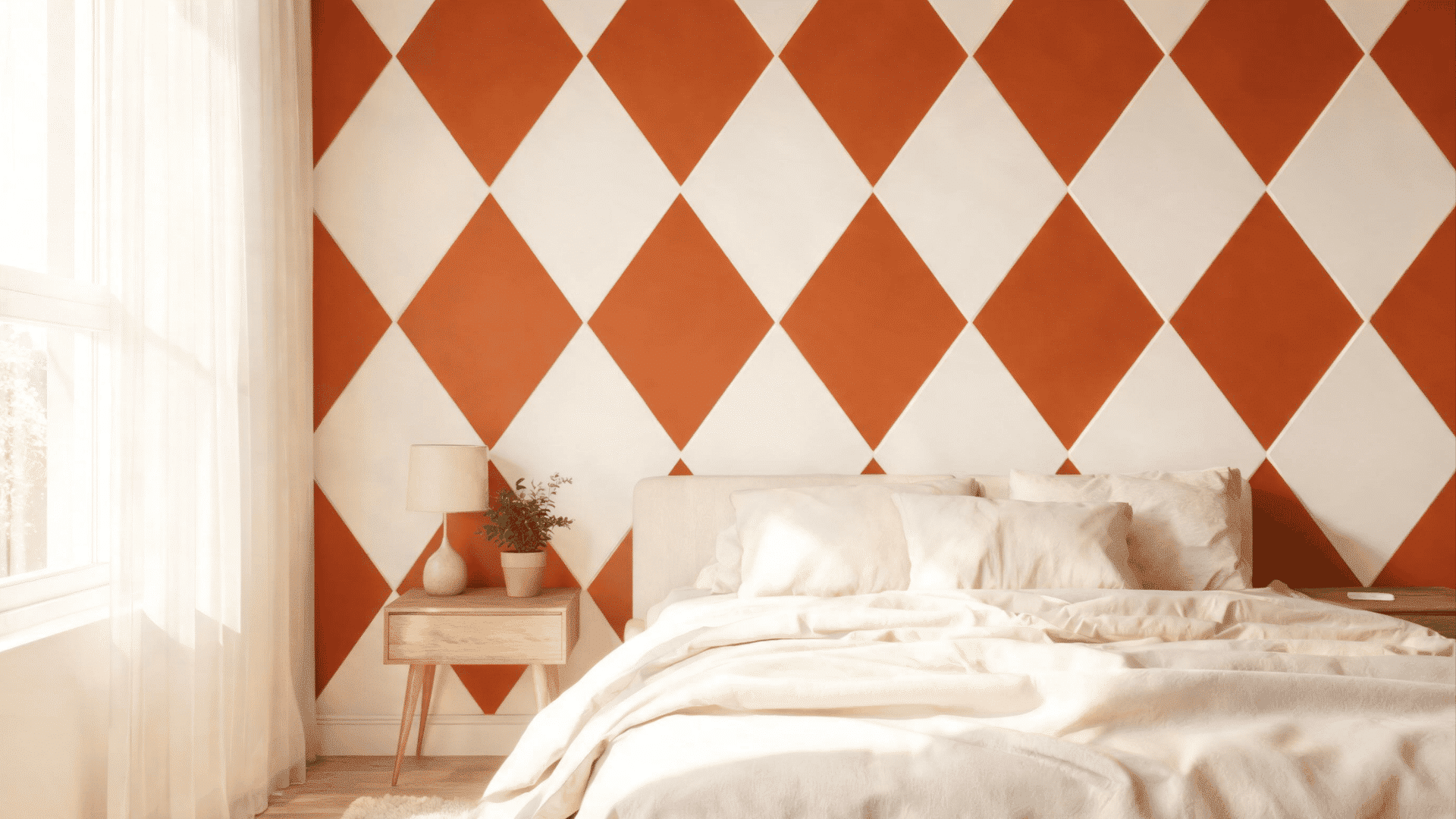

Halloween colors can be much more playful than a basic orange-and-black pairing. Purple, green, pink, cream, burgundy, and muted autumn shades can change the whole feel of a room, craft, invite, or digital design.
I usually start with one main shade, add a grounding neutral, then bring in two or three supporting colors. That keeps the mix interesting without making every color compete for attention.
Below, you will find ready-to-use combinations with HEX codes, including classic, witchy, pastel, vintage, forest, neon, and autumn options.
Pick one that fits your project, copy the codes you need, and adjust the balance depending on where the palette will appear. A small color shift can change the whole seasonal feel.
What Are the Main Halloween Colors?
The main Halloween colors are orange and black, with purple, green, white, red, and brown often added for different themes. The origins of Halloween also help explain why black and orange became such familiar colors for the holiday, especially through older customs and autumn harvest traditions.
Purple works well for witch-inspired themes, and green suits monsters, potions, or forest settings. White and cream soften darker combinations, while red pushes a palette toward vampire themes.
Brown, rust, mustard, and olive work better when you want Halloween to sit naturally beside regular fall decor.
The table below gives you a quick starting point before you choose a full palette.
|
Color |
Works Well For |
|---|---|
|
Orange |
Pumpkins, fall decor, party graphics |
|
Black |
Contrast, bats, spiders, dark backgrounds |
|
Purple |
Witches, magic, night themes |
|
Green |
Monsters, potions, forest themes |
|
White or Cream |
Ghosts, bones, lighter backgrounds |
|
Red |
Vampire themes and darker accents |
|
Brown |
Rustic, vintage, and autumn styling |
Halloween Color Palette Ideas
Each palette below has a different mood, so you can choose one based on your room, craft, party, or digital project. Use the HEX codes as a color reference, then adjust how much of each shade appears in your final setup.
1. Classic Orange and Black Halloween Palette

Orange and black create the most recognizable Halloween combination, but adding charcoal, cream, and rust gives it more depth. Use orange across pumpkins, textiles, or graphics, then bring in black for stronger contrast.
Cream keeps the darker shades from taking over, while rust adds a warmer fall touch. This palette works well for porches, party tables, signs, paper crafts, and social graphics.
- Pumpkin Orange: #F47C20
- Black: #171717
- Charcoal: #333333
- Bone Cream: #F4E8D0
- Rust: #A8441C
2. Traditional Orange, Purple, Green, and Black Palette

This palette combines four colors closely tied to Halloween decorating. Orange brings in pumpkins, purple suits witch-inspired details, and green works well for monsters, slime, and potion themes.
Black keeps the brighter colors grounded, while cream gives the combination some breathing room. Use it for family parties, children’s crafts, front door decor, printable tags, or invitations that need a clear seasonal look.
- Pumpkin Orange: #F57C00
- Deep Purple: #5B2A86
- Monster Green: #7CB342
- Black: #161616
- Warm Cream: #F3E6C8
3. Witchy Purple Halloween Palette

Deep plum and violet make this palette feel distinctly witch-inspired without depending on bright orange. Lavender gray lightens the combination, while black adds contrast and antique cream softens the overall mix.
I like this palette for potion displays, candle groupings, mantels, invitations, and bedroom accents. Keep plum as the main shade, then use violet and gray in smaller areas for balance.
- Deep Plum: #3D1E4F
- Violet: #7A3E9D
- Lavender Gray: #B7B2C0
- Soft Black: #19151C
- Antique Cream: #E8D9BE
4. Gothic Halloween Color Palette

Oxblood, black, and dark plum give this palette a much deeper tone than traditional Halloween orange. Muted antique gold adds warmth, while ivory keeps darker objects and printed details easy to see.
Use this mix for dining tables, candle displays, entry tables, invitations, or fabric accents. Keep gold limited to small details such as frames, candlesticks, ribbons, or trays rather than larger areas.
- Oxblood: #5B1722
- Black: #121212
- Dark Plum: #3A233A
- Muted Antique Gold: #A3834A
- Ivory: #E9E0D0
5. Pastel Halloween Color Palette

Lavender, peach, mint, pale pink, and cream create a softer Halloween look that still feels seasonal. These slightly muted shades work especially well with friendly ghosts, painted pumpkins, banners, party stationery, and children’s room decor.
Let lavender or peach carry most of the color, then bring in mint and pink through smaller details. Cream helps separate the pastels so the final mix does not feel crowded.
- Pastel Lavender: #C9B6E4
- Soft Peach: #F5B89A
- Pastel Mint: #BFD8C2
- Pale Pink: #E7B7C8
- Soft Cream: #F6E9D9
6. Cute Halloween Color Palette

This combination is brighter and more playful than the pastel palette. Pumpkin peach keeps a clear seasonal connection, while lilac, bubblegum pink, and mint add softer, candy-inspired colors.
Cocoa brown gives the lighter shades enough contrast without using black. Try this palette for ghost garlands, treat bags, painted mini pumpkins, stickers, candy bowls, or children’s parties. Keep brown mainly for outlines and smaller details.
- Pumpkin Peach: #F3A56F
- Soft Lilac: #BFA6D9
- Bubblegum Pink: #E98EB5
- Fresh Mint: #A8D8C2
- Cocoa Brown: #5C463C
7. Vintage Halloween Color Palette

Burnt orange, mustard, olive, faded black, and parchment create a muted Halloween combination with a retro feel. These colors pair naturally with aged paper, wooden decor, thrifted frames, fabric banners, and faded pumpkin shades.
Use parchment across backgrounds or larger areas, then add faded black for contrast. Burnt orange should carry most of the Halloween reference, while mustard and olive help connect it with fall.
- Burnt Orange: #B85C2B
- Mustard: #C89B3C
- Olive: #6F7348
- Faded Black: #2B2927
- Parchment: #E3D3B0
8. Neutral Halloween Color Palette

Warm beige, taupe, charcoal, muted pumpkin, and sage work well when traditional Halloween colors feel too strong for your space. These shades sit comfortably beside wood, linen, stone, baskets, and other natural finishes.
Use beige or taupe across larger areas, then add muted pumpkin for the seasonal connection. Charcoal works best on bats, frames, candles, or smaller objects that need stronger definition.
- Warm Beige: #D7C5AF
- Taupe: #9D8977
- Charcoal: #3C3937
- Muted Pumpkin: #C77646
- Sage: #90977B
9. Haunted Forest Halloween Palette

Forest green and moss lead this palette, giving Halloween a darker woodland feel instead of the usual orange-first approach. Bark brown supports the natural theme, while burnt orange adds a smaller seasonal accent.
Bone keeps the mix from becoming too dark. Use these colors with branches, mushrooms, ravens, dried leaves, lanterns, or outdoor tables where earthy materials are already part of the setting.
- Forest Green: #2F4A38
- Moss Green: #687A4D
- Bark Brown: #4A372C
- Burnt Orange: #B95F36
- Bone: #DED5BF
10. Vampire Halloween Color Palette

Deep red and burgundy give this palette its vampire-inspired character, while near-black adds enough contrast for darker Halloween details. Dusty rose softens the stronger reds, and muted brass gold brings warmth into smaller accessories.
Use the combination for dinner tables, party invitations, ribbons, fabric accents, candles, or themed displays. Let burgundy cover larger areas and save brighter red for places where you want attention.
- Blood Red: #7A1F2A
- Deep Burgundy: #4D1821
- Near Black: #161113
- Dusty Rose: #B7777F
- Muted Brass Gold: #9B7A45
11. Candy Corn Halloween Palette

Orange, golden yellow, and cream create the warm base of this candy-inspired Halloween palette. Chocolate brown adds depth, while purple keeps the combination from looking too close to regular autumn decor.
It works well for treat stations, classroom crafts, garlands, painted pumpkins, and family parties. Use cream for larger areas, orange as the main seasonal color, then bring in yellow, brown, and purple more sparingly.
- Candy Orange: #F77F1F
- Golden Yellow: #F6BF3E
- Vanilla Cream: #FFF0D5
- Chocolate Brown: #6C3D2A
- Candy Purple: #6A3D8F
12. Neon Halloween Color Palette

Electric green, hot purple, bright orange, and hot pink give this palette a much louder Halloween party feel. Black is important here because it separates the brighter shades and keeps them readable.
Use the combination for party signs, digital graphics, glow-themed decor, treat labels, or teen Halloween setups. Choose two neon colors as your main pair, then use the remaining shades only for smaller accents.
- Electric Green: #A4F13B
- Hot Purple: #8D39E7
- Bright Orange: #FF7A00
- Hot Pink: #F044A6
- Black: #101010
13. Black and White Halloween Palette

Black and off-white create a simple base that works especially well with ghosts, bats, silhouettes, striped pumpkins, table linens, and mantel decor.
Charcoal and warm gray soften the strong contrast, while pumpkin orange adds one clear seasonal accent. Keep black and white as the main pair, then use gray between them.
A small amount of orange is enough to make the palette feel distinctly Halloween.
- Black: #121212
- Off White: #F8F5EE
- Charcoal: #424242
- Warm Gray: #A49D95
- Pumpkin Orange: #D96B32
14. Pink Halloween Color Palette

Rose pink and dusty mauve create a softer Halloween scheme, while pumpkin orange keeps the seasonal connection clear. Warm cream lightens the palette, and charcoal plum adds enough contrast for candles, bats, lettering, or darker accessories.
This combination works well for bedrooms, party tables, painted pumpkins, treat bags, and social graphics. Use mauve across larger areas and save brighter pink for smaller details.
- Rose Pink: #D86C9A
- Dusty Mauve: #9B6685
- Pumpkin Orange: #D97946
- Warm Cream: #F5E4D4
- Charcoal Plum: #3A3338
15. Autumn Halloween Color Palette

Rust, mustard, olive, walnut brown, and pumpkin orange make Halloween blend naturally into regular fall decorating. This palette suits homes that already use dried leaves, baskets, warm wood tones, stems, and seasonal textiles.
Pumpkin orange keeps the Halloween connection clear without overpowering the other colors. Rust, mustard, olive, and warm wood tones also work naturally with living room fall decor because the same colors can carry through pillows, pumpkins, throws, and smaller accents.
- Rust: #B65A35
- Mustard: #C89A3A
- Olive: #73754B
- Walnut Brown: #654B3E
- Pumpkin Orange: #D47739
Which Halloween Color Palette Should You Choose?
Choose the palette based on the feeling you want first. For a familiar Halloween look, orange and black are the safest choice.
Pastels and pinks feel softer, while burgundy, plum, and black suit darker themes. Neutral and autumn palettes work better when Halloween decor needs to blend with an existing room.
Once you have chosen your colors, repeat them throughout your fall decor with pillows, blankets, pumpkins, and tabletop accents to help the room feel more connected.
Use this chart to narrow your options quickly.
|
If You Want |
Start With |
|---|---|
|
Classic Halloween |
Classic Orange and Black |
|
Witch-inspired |
Witchy Purple |
|
Dark look |
Gothic or Vampire |
|
Soft colors |
Pastel |
|
Playful decor |
Cute or Candy Corn |
|
Muted home decor |
Neutral |
|
Woodsy style |
Haunted Forest |
|
Retro feel |
Vintage |
|
Bright party colors |
Neon |
|
Minimal look |
Black and White |
|
Fall crossover |
Autumn |
How Do You Use a Halloween Color Palette?
Once you pick a palette, decide where each color will appear rather than using all five equally. Give the largest surfaces to one main shade, use a second color on medium-sized pieces, then save the strongest shades for accents.
A simple 60-30-10 split works as a starting point:
- Use about 60 percent for the main color.
- Use about 30 percent for the supporting shade.
- Use about 10 percent for the strongest accent.
For decor, apply this across textiles, pumpkins, candles, tableware, and wall pieces. For graphics, use the same idea across backgrounds, text, headings, and smaller details.
For digital designs, check the contrast between text and its background so headings and smaller text remain easy to read.
How Do You Create Your Own Halloween Color Palette?
Build your palette around one anchor color instead of choosing five shades at once. Start with orange, purple, green, burgundy, black, or another shade that clearly fits your Halloween theme.
Then build around it:
- Pick one main Halloween color.
- Add one light or dark neutral for contrast.
- Choose two supporting shades that work beside the main color.
- Add one accent color for smaller details.
- Save the exact HEX codes if you plan to use the palette digitally.
You can also use these online color-mixing tools to compare HEX codes and see how different shades work together before settling on your final palette.
Quick Check! View all five swatches together. If one color feels disconnected, replace that shade before using the palette.
At the End
The right Halloween colors make it much easier to keep a room, craft, invitation, or digital design visually connected.
You can stay with orange and black, move toward soft pastel shades, use burgundy and plum for a darker look, or keep things quiet with beige, sage, and muted pumpkin.
My favorite approach is to choose the mood first, then the individual colors. That small switch usually makes the final combination feel more intentional and much easier to repeat across different pieces.
Save the HEX codes from the palette that fits your project, then test the colors together before buying or making anything.
Which of these 15 palettes would you use first this Halloween? Tell us your favorite in the comments!
Frequently Asked Questions
What Halloween Colors Work Well for a Wedding?
Burgundy, black, plum, ivory, muted orange, and antique gold can create a seasonal wedding palette without relying on bright novelty colors.
Can Blue Be Used in a Halloween Color Palette?
Yes. Midnight blue, navy, or smoky blue can replace black or purple and pair well with orange, silver, cream, or muted green.
How Many Colors Should a Halloween Palette Have?
Four or five colors are usually enough. This gives you a main shade, supporting colors, a neutral, and an accent without making the palette crowded.
What Halloween Colors Work Best for Kids?
Orange, purple, lime green, pink, yellow, and lighter pastels work well for children’s Halloween themes because they feel playful without becoming overly dark.