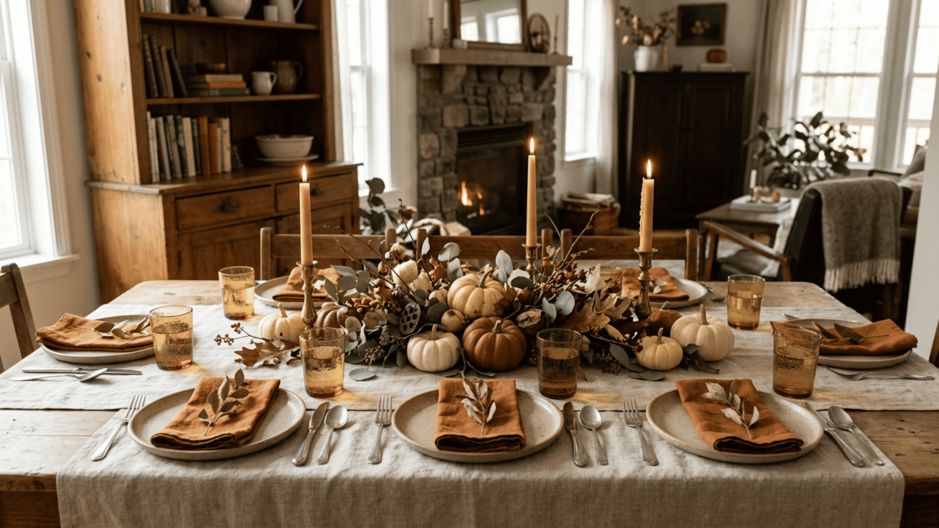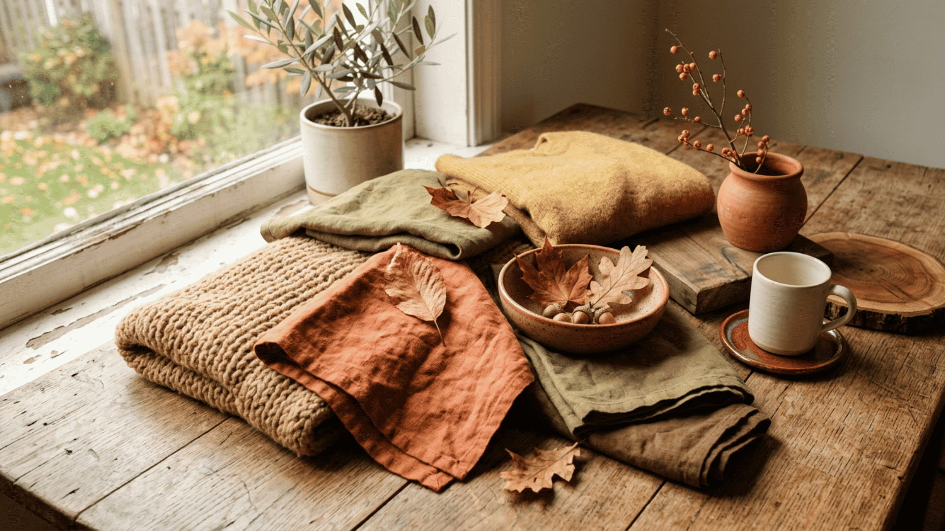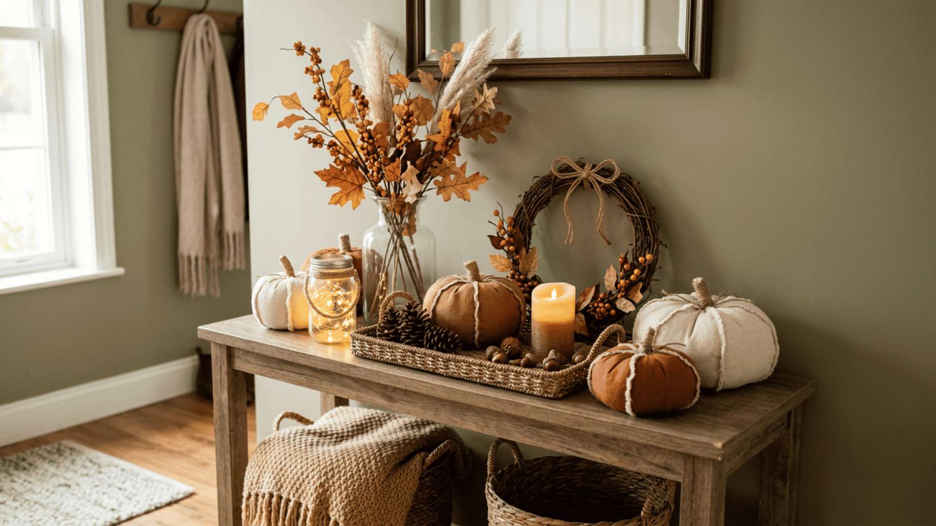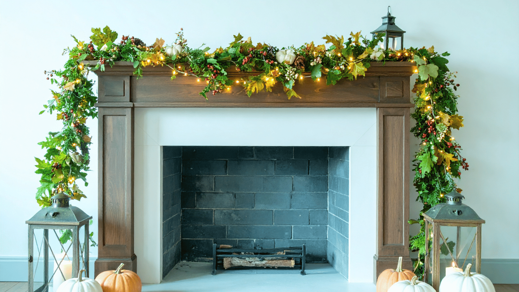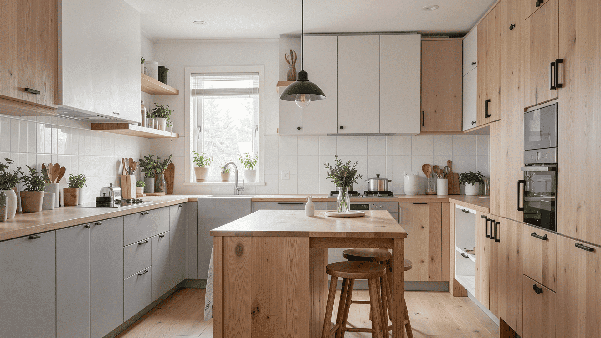
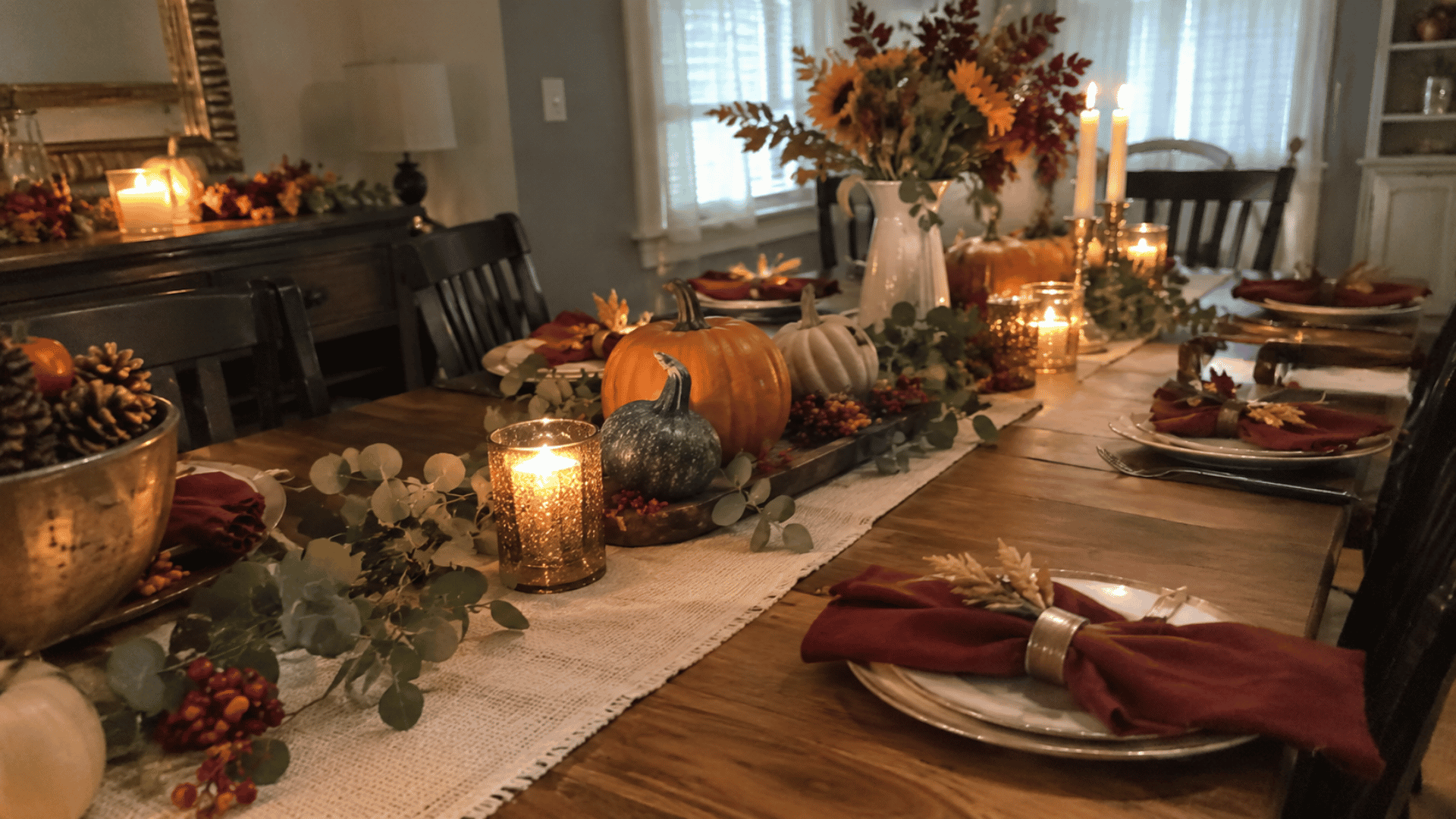
Thanksgiving colors usually include pumpkin orange, cranberry red, golden yellow, brown, cream, and earthy green. These shades are closely tied to fall leaves, seasonal foods, wood, wheat, and other harvest details.
If you are searching for Thanksgiving colors, the answer can go beyond the traditional fall palette. Modern combinations also use softer neutrals, muted greens, deeper reds, and cooler accent shades depending on the style you want.
In this guide, you will find traditional Thanksgiving colors, ready-to-use palette ideas, matching hex codes, and simple ways to apply them to home decor, tablescapes, crafts, invitations, graphics, and seasonal branding.
What are the Traditional Thanksgiving Colors?
Traditional Thanksgiving colors usually include pumpkin orange, cranberry red, harvest gold, earthy brown, muted green, and cream.
Orange, red, gold, and brown bring warmth, while green and cream soften the palette. I usually choose two or three main colors and use the rest as smaller accents.
This table shows what each shade is commonly associated with.
|
Color |
Common Shade |
Seasonal Reference |
|---|---|---|
|
Orange |
Pumpkin, burnt orange |
Pumpkins and leaves |
|
Red |
Cranberry, brick |
Cranberries and foliage |
|
Gold |
Mustard, amber |
Wheat and corn |
|
Brown |
Chestnut, walnut |
Wood and earth |
|
Green |
Olive, sage |
Herbs and foliage |
|
Cream |
Ivory, wheat |
Linen and dried grass |
What Are Some Popular Thanksgiving Color Palettes?
Thanksgiving palettes can stay close to traditional harvest colors or use softer, darker, or more modern combinations. The best choice depends on the setting, project, and mood you want.
Color Note! The hex codes below are suggested design shades, not official Thanksgiving color standards. Printed colors may also look different from the same shades on a screen.
1. Classic Harvest Palette

A classic harvest palette brings together the colors most strongly associated with Thanksgiving. It works well for dining tables, porch decor, invitations, paper crafts, and family graphics.
Cream works well as the base, while orange, red, and gold can be used in smaller amounts for warmth and contrast.
Suggested Palette:
- Pumpkin orange: #C96A2B
- Cranberry red: #8E2F2F
- Harvest gold: #D39A32
- Walnut brown: #6B4935
- Cream: #F2E3C6
2. Rustic Earthy Palette

A rustic earthy palette feels natural and works especially well with wood, linen, kraft paper, dried stems, clay, and woven materials.
This combination suits farmhouse decor and DIY crafts because slight shade differences still look connected, not mismatched.
Suggested Palette:
- Rust: #A65332
- Terracotta: #B96A4A
- Olive: #6F7147
- Walnut brown: #604536
- Beige: #D8C4A8
3. Warm Neutral Palette

A warm neutral color palette works well when you want seasonal color without relying heavily on orange or red. It suits table linens, menus, place cards, packaging, and rooms with stronger permanent colors.
Adding one darker brown detail helps prevent the lighter shades from blending together.
Suggested Palette:
- Ivory: #F4EBDD
- Oatmeal: #D8C7AE
- Taupe: #A8917B
- Caramel: #B87845
- Soft gold: #C5A45D
4. Sage and Terracotta Palette

Sage and terracotta create a softer modern fall combination that still feels connected to Thanksgiving. The green cools the warmer clay tones, while cream and brown keep the palette balanced.
Use this mix for tablescapes, invitations, crafts, or designs with dried greenery.
Suggested Palette:
- Sage: #8D9B7A
- Terracotta: #B8664B
- Cream: #F2E7D5
- Warm brown: #72513D
- Muted gold: #C19A55
5. Burgundy and Gold Palette

Burgundy and gold create a deeper Thanksgiving palette that works well for evening dinners, printed menus, candles, glassware, and seasonal graphics.
Cream makes a useful background because it keeps darker red shades easy to read while allowing gold to remain a smaller accent.
Suggested Palette:
- Burgundy: #6E2638
- Wine red: #7A3345
- Antique gold: #B58A3A
- Cream: #F1E4CF
- Dark brown: #4C382F
6. Moody Jewel-Tone Palette

Jewel tones give Thanksgiving a darker color direction while still fitting the fall season. Plum, forest green, burgundy, and navy work well for evening tables, menus, floral graphics, and candlelit spaces.
A pale neutral can be added so the deeper colors have enough contrast.
Suggested Palette:
- Plum: #5B314D
- Forest green: #344A38
- Burgundy: #6D2F3F
- Navy: #26354A
- Muted gold: #B28A45
7. Navy and Copper Palette

Navy and copper offer a less traditional Thanksgiving combination with stronger contrast. Navy gives tables, menus, packaging, and graphics a solid base, while copper and rust bring back the warmth of fall.
I like this palette for settings that already include dark plates, wood, or blue details.
Suggested Palette:
- Navy: #263A53
- Copper: #B66A3C
- Cream: #EFE2CF
- Rust: #9A4E32
- Walnut: #5A4034
8. Soft Blush and Muted Fall Palette

A blush-based palette works well when bright orange, red, or brown feels too strong for the setting. Dusty rose, peach, cream, and sage suit brunch tables, invitations, paper crafts, and lighter rooms.
I keep terracotta in the mix because it gives the softer colors a stronger late-fall connection.
Suggested Palette:
- Dusty rose: #C58F8B
- Peach: #DCA07B
- Cream: #F4E8D8
- Muted terracotta: #B86F58
- Sage: #909A82
Which Thanksgiving Color Palette Fits Your Style?
Match the palette to the style of the room, table, craft, or graphic. Traditional spaces usually suit warm harvest shades, while modern or minimal designs work better with softer neutrals and muted greens.
Darker colors fit evening settings, while blush and peach keep the look lighter. Use this table to narrow down the best color direction for your project.
|
Style |
Palette to Try |
|---|---|
|
Traditional |
Orange, cranberry, gold, brown |
|
Rustic |
Rust, olive, beige, walnut |
|
Modern |
Sage, terracotta, cream |
|
Minimal |
Ivory, taupe, caramel |
|
Formal |
Burgundy, cream, gold |
|
Dark |
Plum, forest green, navy |
|
Bold |
Navy, copper, rust |
|
Soft |
Blush, peach, cream, sage |
How Do You Combine Thanksgiving Colors?
Start with three roles: a base color, a supporting shade, and an accent. A 60-30-10 split keeps the palette balanced without making every Thanksgiving color compete for attention.
Let the base cover most of the space, use the supporting color on larger details, and save the strongest shade for smaller accents.
For tables, cream linens can carry rust napkins and cranberry details. In graphics, a light background with a darker supporting color keeps text easier to read. I also avoid pairing two similar midtones because they can lose contrast in print.
Try these combinations as a starting point:
- Cream base + rust support + cranberry accent
- Beige base + sage support + terracotta accent
- Ivory base + burgundy support + gold accent
- Cream base + navy support + copper accent
How Do You Use Thanksgiving Colors in Decor and Design?
Use the same palette differently depending on the project. Home decor can repeat one or two shades across removable accents, while tablescapes work best with a neutral base and stronger details.
Crafts benefit from a smaller color set, and graphics need enough contrast for text and buttons to stay clear.
Use this table to match the palette to the project.
|
Use |
Best Color Approach |
Practical Example |
|---|---|---|
|
Home Decor |
Repeat 1 to 2 shades across accents |
Rust pillows, cream throws, olive wreath |
|
Tablescapes |
Start neutral, then add a stronger accent |
Cream linens, burgundy napkins, gold candles |
|
Crafts |
Limit the project to 3 to 4 colors |
Orange cardstock, brown felt, cream ribbon |
|
Graphics and Branding |
Use light backgrounds, dark text, one accent |
Cream background, navy text, copper buttons |
Why Are These Colors Associated With Thanksgiving?
Thanksgiving colors come mainly from late fall and harvest imagery. Orange, red, and gold also connect with traditional Thanksgiving foods such as pumpkins, squash, corn, and cranberries.
Gold and yellow also reflect wheat and dried grasses, while brown connects with wood, soil, and other natural materials.
Green fits through herbs, foliage, gourds, and seasonal arrangements. Cream appears often in linens, ceramics, candles, and neutral table settings, where it helps balance stronger fall shades.
These associations are traditional, not fixed rules. Navy, blush, plum, sage, and other newer shades can still suit Thanksgiving when they are paired with warm tones or natural materials.
Fun Fact! Yellow and orange fall colors come from carotenoids already present in leaves, while red and purple shades come from anthocyanins.
Final Thoughts
Thanksgiving colors can stay traditional with pumpkin orange, cranberry red, gold, brown, green, and cream, or shift toward sage, terracotta, navy, plum, blush, and other softer or darker combinations.
The best palette depends on where you plan to use it. A table may need a neutral base and one stronger accent, while graphics and crafts can handle more contrast.
For home decor, repeating a few shades across smaller pieces usually keeps the look consistent. Start with the palette that fits your project, then adjust the shades to suit the room, material, or design.
Which Thanksgiving color combination would you use this year? Comment below and share your favorite.
Frequently Asked Questions
Are There Official Thanksgiving Colors?
No. Thanksgiving has no official color standard. Traditional palettes developed around autumn harvest foods, foliage, natural materials, and seasonal decorating.
Can I Use Black and White for Thanksgiving?
Yes. Black and white can work as a neutral base when paired with warmer accents such as rust, burgundy, copper, gold, or greenery.
How Do I Make Thanksgiving Graphics Easy to Read?
Use strong text-to-background contrast and never rely on color alone to communicate information. W3C recommends checking contrast during the design stage.
Can I Use Thanksgiving Colors in a Small Room?
Yes. In a small living room, keep walls and large surfaces light, then use deeper Thanksgiving shades through pillows, candles, artwork, or other smaller removable accents.
Do Thanksgiving Colors Have to Match Exactly?
No. Slight shade differences often look natural, especially with wood, linen, dried foliage, ceramics, and other materials that already vary in tone.