
Benjamin Moore color of the year 2026 is Silhouette AF-655, a deep brown paint color with charcoal and espresso undertones.
The selection continues an interesting progression in Benjamin Moore’s recent Color of the Year choices. After Raspberry Blush in 2023, Blue Nova in 2024, and Cinnamon Slate in 2025, the brand has shifted toward a darker and more grounded neutral.
In this article, I’ll explain what Silhouette AF-655 looks like, how it compares to Cinnamon Slate, where it works best, which colors pair well with it, and whether it’s the right choice for your home.
What is Benjamin Moore’s Color of the Year 2026?
Benjamin Moore announced Silhouette AF-655 as its Color of the Year 2026 on October 16, 2025. Unlike many brown shades that lean toward red or muddy tones, it has a cleaner appearance that allows it to work across a wide range of design styles.
The selection followed a yearlong review of consumer behavior, design trends, sales data, cultural influences, and trade insights.
Chosen from a portfolio of more than 3,500 colors, Silhouette AF-655 also anchors the Benjamin Moore Color Trends 2026 palette, which includes seven complementary shades.
Watch this video by Benjamin Moore Paints for a visual representation.
Is Silhouette AF-655 Brown, Charcoal, or Black?
Benjamin Moore classifies Silhouette AF-655 as brown.Depending on lighting and surrounding finishes, it may appear charcoal-like in some areas, but it does not read as a true black paint color.
What Undertones Does Silhouette AF-655 Have?
The color carries espresso and smoky undertones. These undertones add depth while helping the shade remain relatively neutral compared with browns that show stronger red, orange, or purple influences.
Is Silhouette AF-655 Warm or Cool?
Silhouette AF-655 sits on the warmer side of the spectrum.Its brown base adds warmth, while the darker composition prevents it from feeling overly earthy.
How Have Benjamin Moore’s Color Choices Changed Since 2022?
Looking back at Benjamin Moore’s recent Color of the Year selections, the company’s priorities appear to have shifted several times.
The journey began with a soft, nature-inspired green in 2022, followed by a bold red-orange in 2023 and a blue-violet statement color in 2024. Cinnamon Slate then introduced a calmer, more neutral direction in 2025.
Silhouette AF-655 continues that move toward everyday livability but does so with considerably more depth.
Compared with recent selections, it feels less focused on making a color statement and more focused on creating warmth, contrast, and versatility.
| Year | Color | Color Family | What It Represented |
|---|---|---|---|
| 2022 | October Mist | Soft Green | Nature-inspired color |
| 2023 | Raspberry Blush | Red Orange | Bold statement color |
| 2024 | Blue Nova | Blue Violet | Rich expressive color |
| 2025 | Cinnamon Slate | Plum Brown | Softer neutral transition |
| 2026 | Silhouette AF-655 | Dark Brown | Deeper everyday neutral |
Why Did Benjamin Moore Choose Silhouette AF-655?
Benjamin Moore selected Silhouette AF-655 after a yearlong review of consumer behavior, cultural influences, design movements, and industry insights. According to the brand, several factors contributed to the decision.
- Growing interest in warm tones: Research on emotional design in interior spacesfound that users are increasingly drawn to natural elements and warm tones, making them one of the most visible directions in current interiors.
- Greater Use of Dark Neutrals:From what I’ve seen, darker colors are appearing more often on cabinetry, built-ins, and feature walls rather than being reserved for small accents. That growing comfort could be one of the reasons Benjamin Moore chose it.
- Renewed appreciation for craftsmanship:Handmade materials, textured finishes, and artisanal details continue to influence furniture, décor, and color choices.
- Influence from fashion and lifestyle trends:Benjamin Moore linked the selection to tailoring, heritage-inspired materials, and classic design references that are gaining attention across multiple industries.
- More personal design choices:Instead of following a single dominant look, many homeowners are choosing colors that reflect their individual preferences and lifestyles.
How Does Lighting Affect Silhouette AF-655?
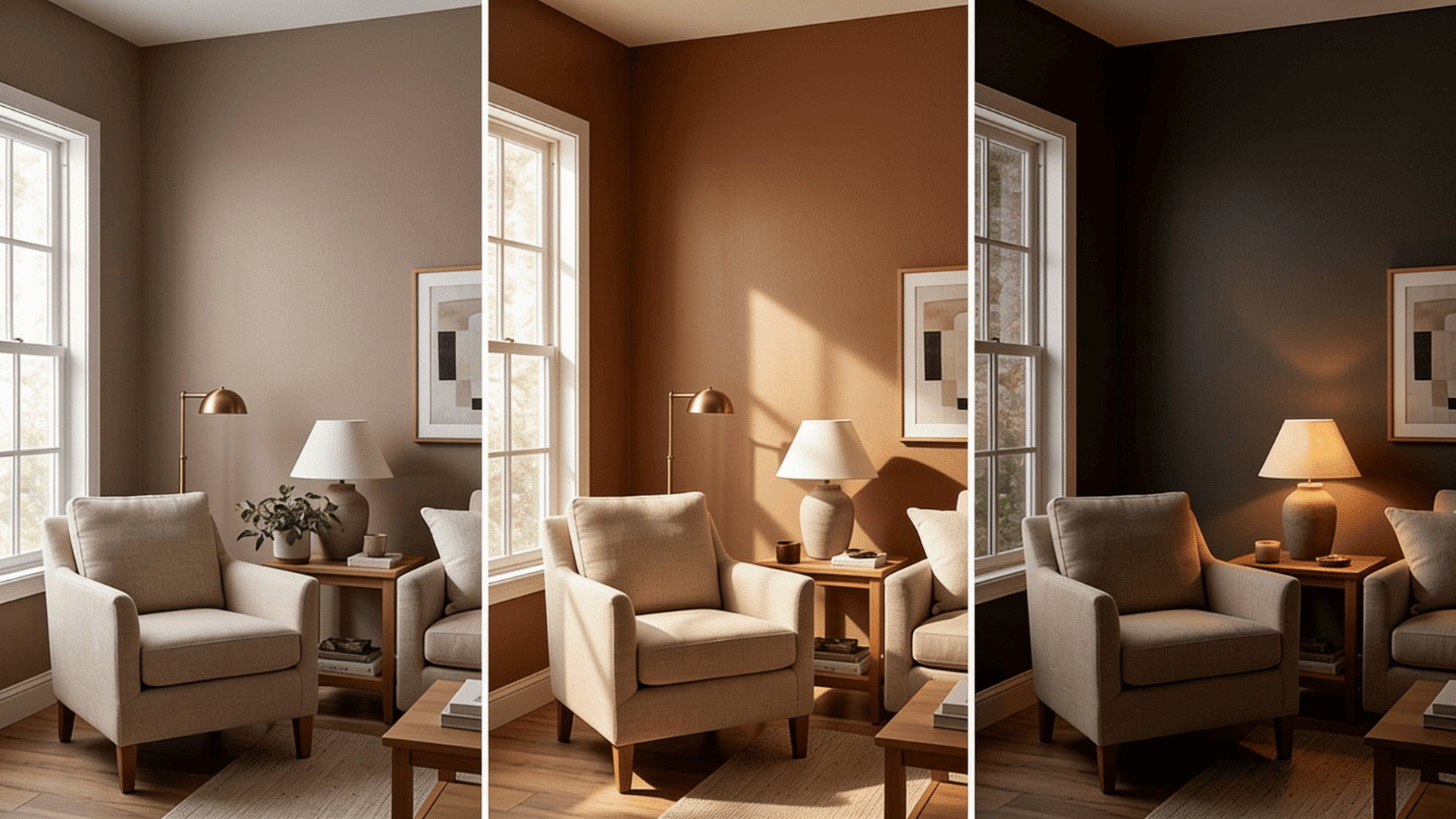
Like most dark paint colors, Silhouette AF-655 can look quite different depending on the amount and direction of light it receives.
When I tested it throughout the day, I noticed that its brown and charcoal qualities became more or less visible as the lighting changed.
- Morning light with curtains open:The color appeared softer and showed more of its brown character.
- Afternoon sunlight: Silhouette AF-655 felt warmer while maintaining its depth.
- Rooms with limited natural light: The shade appeared darker, leaning closer to charcoal.
- Dark, shaded corners:More depth became visible, creating a stronger near-black appearance.
This is one reason I always recommend testing a sample before painting an entire room.
How Does Silhouette AF-655 Compare to Cinnamon Slate?
In my view, Cinnamon Slate felt like a transition color that marked a gradual move away from cool grays. Silhouette AF-655 goes a step further by showing that darker browns are no longer being used sparingly.
| Feature | Silhouette AF-655 | Cinnamon Slate (Benjamin Moore’s 2025 Pick) |
|---|---|---|
| Color Family | Dark Brown | Muted Plum-Brown |
| Overall Mood | Grounded and rich | Soft and understated |
| Undertones | Espresso and charcoal | Plum and brown |
| Best Uses | Walls, cabinets, accents | Living spaces, bedrooms |
| Visual Impact | Stronger presence | More subtle appearance |
Together, these back-to-back selections suggest that paint colors for 2026 are moving further away from cool grays and toward deeper, darker neutrals.
Where does Silhouette AF-655 Work Best?
Because of its depth, Silhouette AF-655 works best in spaces where a darker color can create contrast without taking over the room.
Some of its strongest applications include:
1. Accent Walls and Built-Ins
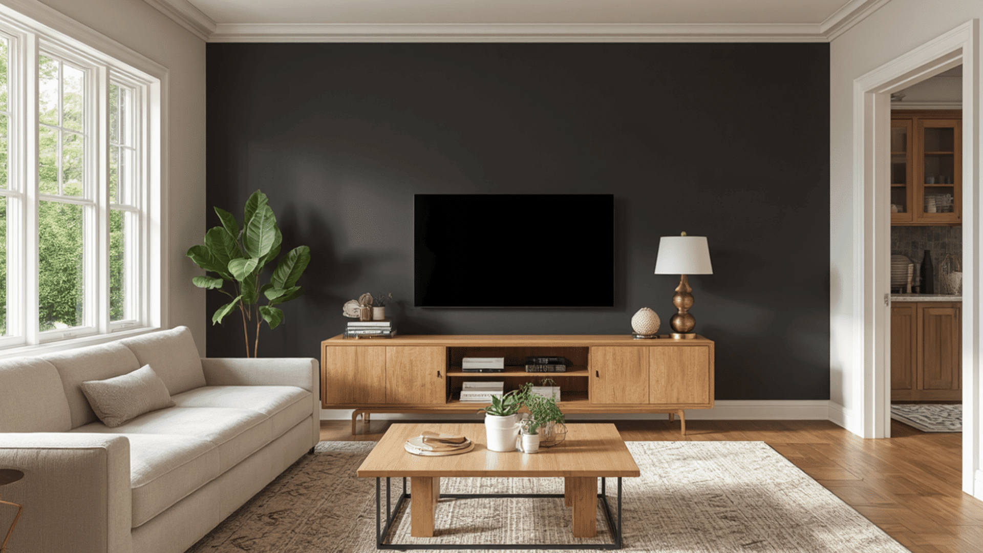
Accent walls and built-ins are among the easiest ways to introduce Silhouette AF-655 without committing to an entire room.
The color creates contrast, draws attention to architectural details, and helps shelving, fireplaces, or media walls feel more intentional.
Best paired with: Framed artwork and brass vases.
2. Kitchen Islands and Cabinetry
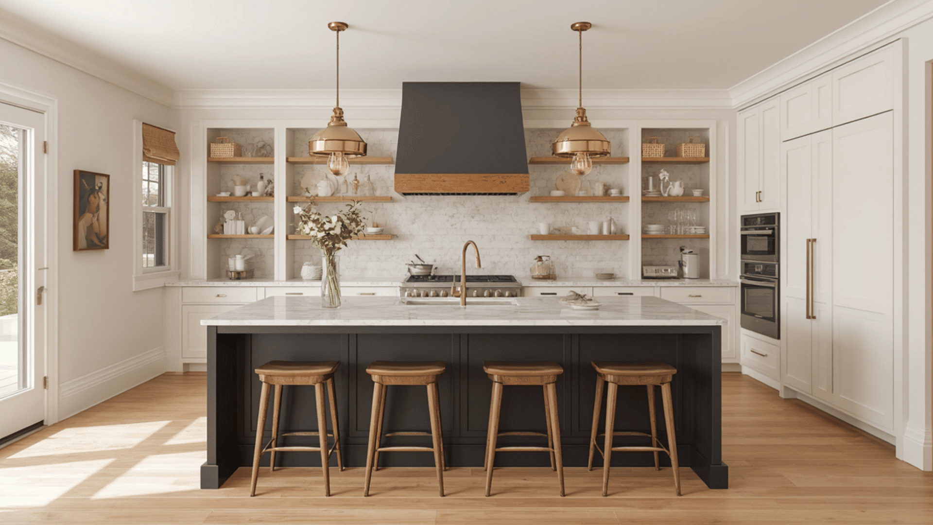
Silhouette AF-655 works especially well on kitchen islands and cabinetry because it creates contrast against lighter countertops and backsplashes.
The darker finish naturally draws attention to the center of the kitchen while offering more warmth than a traditional black cabinet color.
Best paired with: Brass pendant lights and ceramic bowls.
3. Dining Rooms
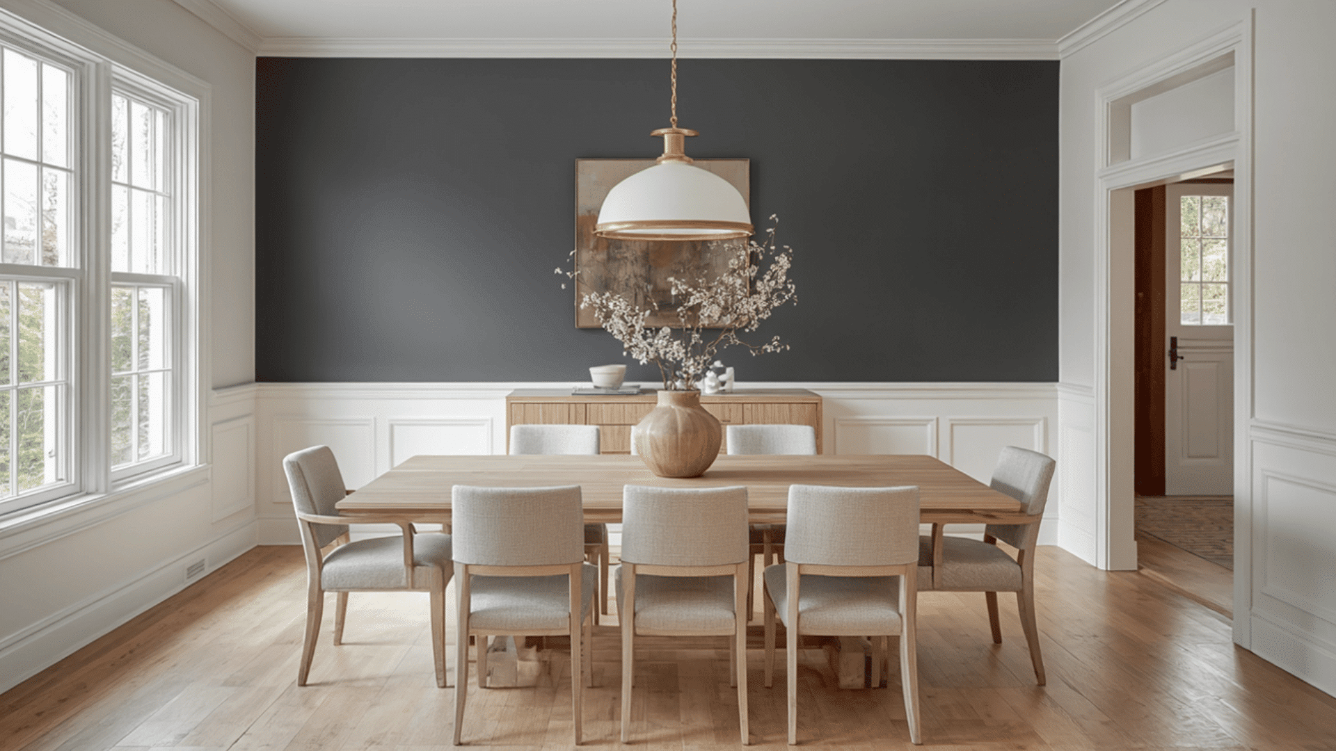
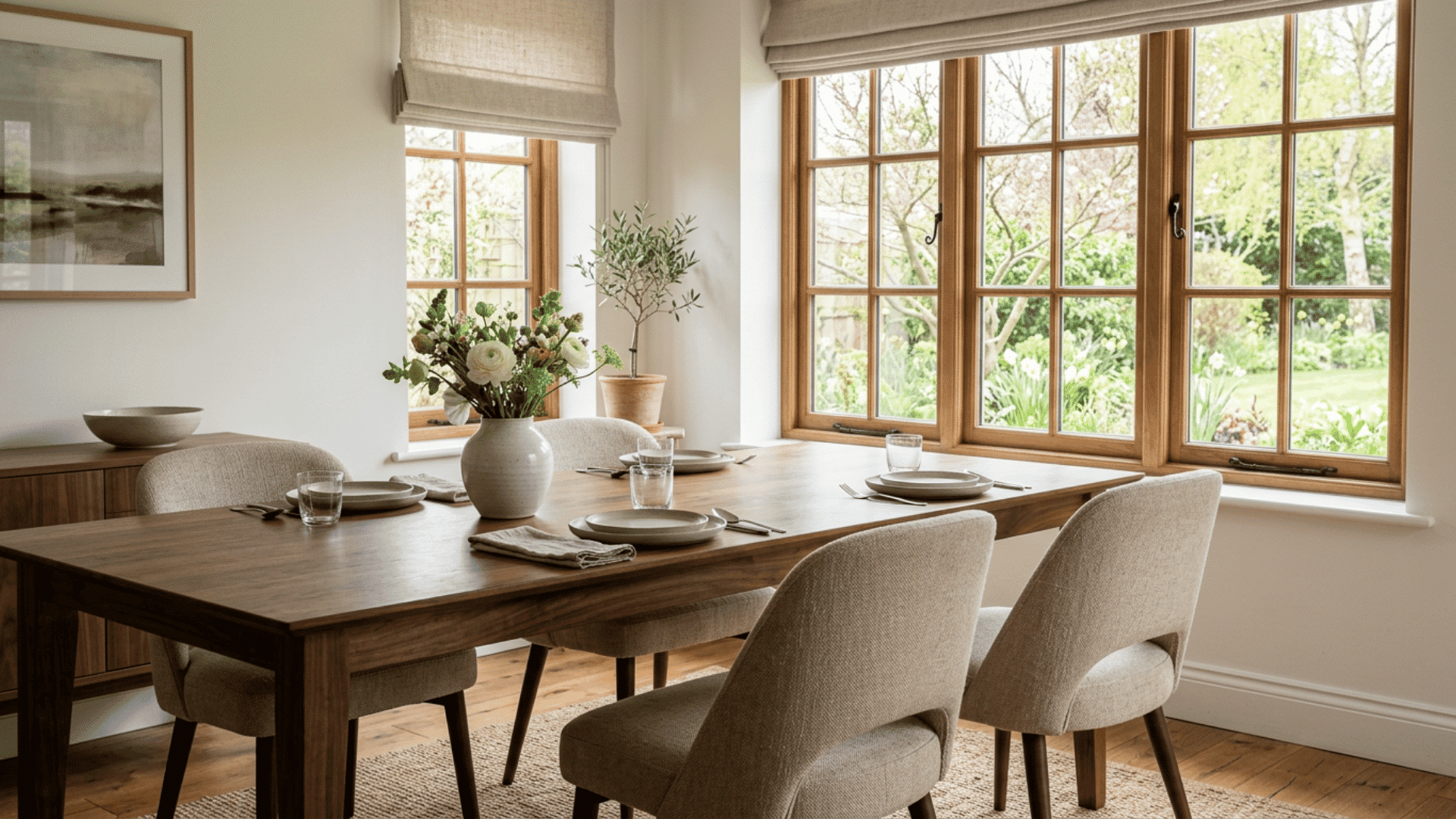
Dining rooms often benefit from darker colors because they create a stronger sense of separation from nearby spaces.
Silhouette AF-655 helps anchor the room and provides contrast against lighter ceilings, trim, and furniture without requiring major design changes elsewhere.
If you are still comparing wall shades, best dining room colors like deep brown, navy, sage, greige, and terracotta can help you choose a dining room shade that feels warm, balanced, and inviting.
Best paired with: Chandeliers and linen table runners.
4. Powder Rooms
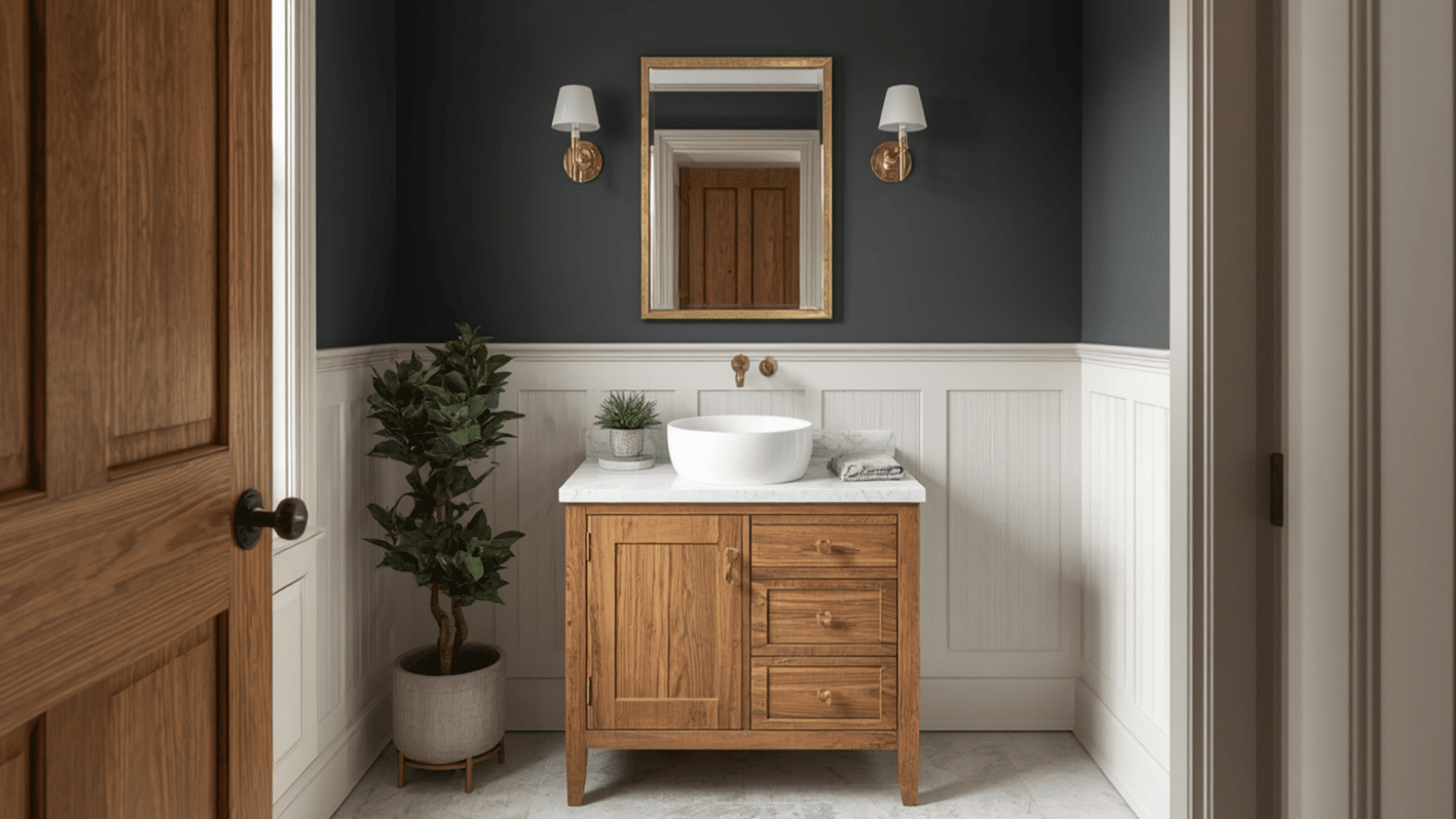
Powder rooms are one of the safest places to experiment with darker paint colors.
Because the space is smaller, the Silhouette AF-655 can make an impact without overwhelming the room. Mirrors, hardware, and lighter finishes also become more noticeable against the darker backdrop.
Best paired with: Brass mirrors and wall sconces.
5. Home Offices
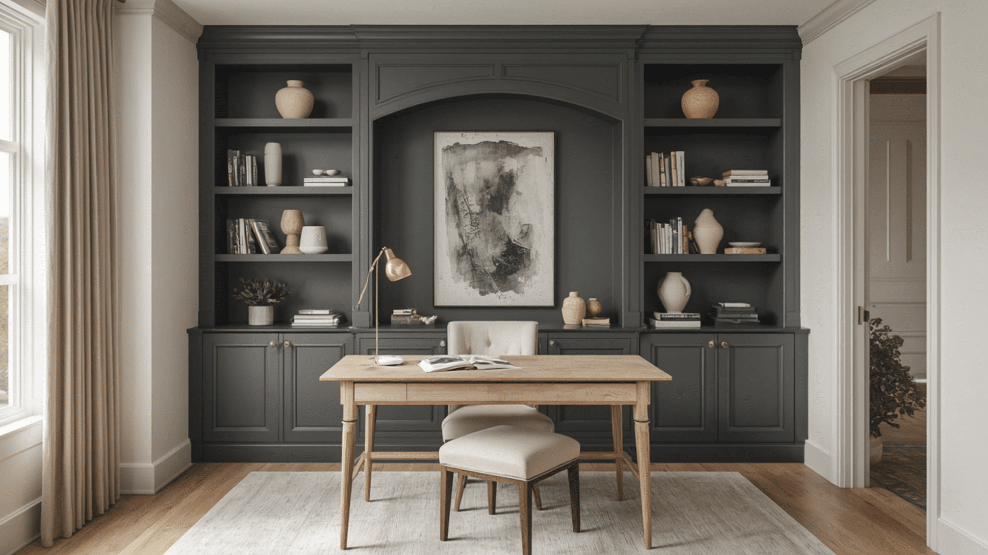
A home office should feel focused without appearing cold or overly formal.
Silhouette AF-655 works well on shelving, cabinetry, and feature walls, adding depth and contrast. Combined with lighter furniture and natural materials, it can help the space feel more balanced.
Best paired with: Desk lamps and textured area rugs.
6. Reading Nooks and Libraries
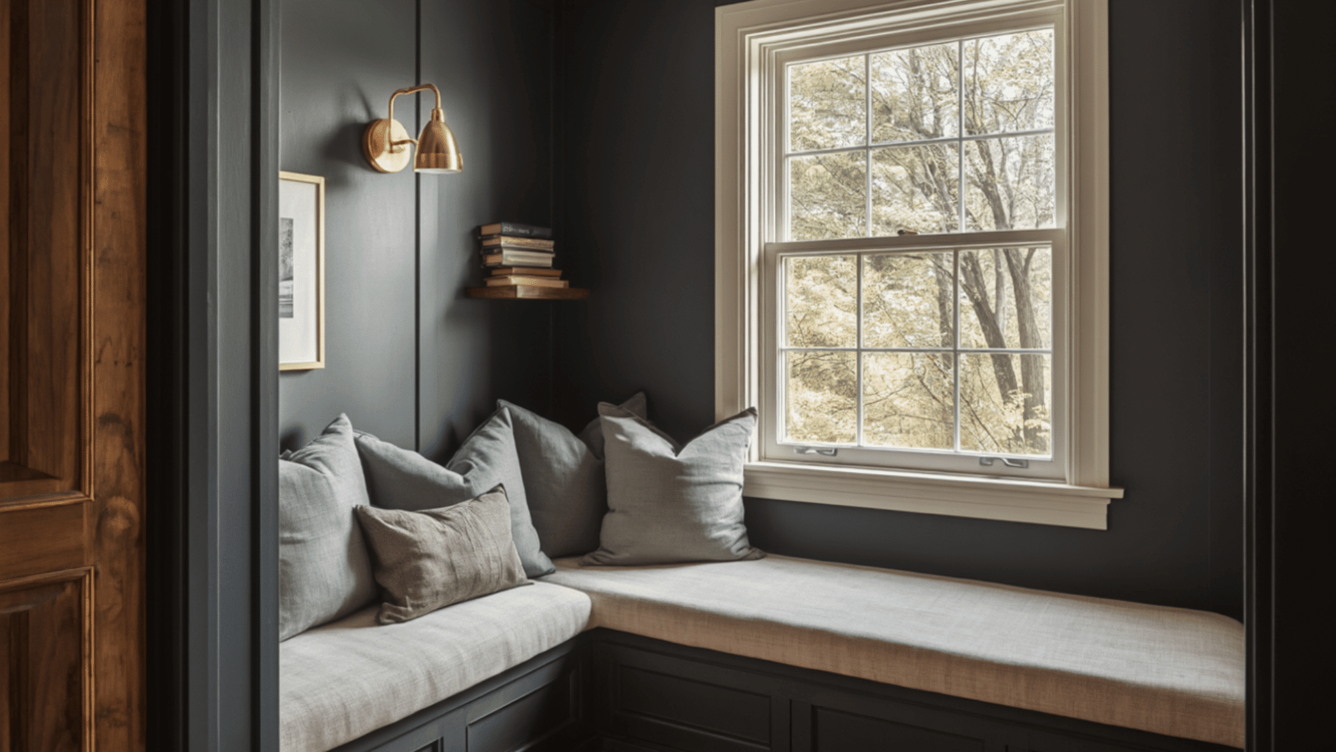
From what I’ve seen, darker paint colors often feel most natural in enclosed spaces designed for reading and relaxation.
Silhouette AF-655 helps books, wood finishes, and decorative objects stand out while adding depth to the room without relying on brighter accent colors.
Best paired with: Floor lamps and woven throw blankets.
Which Colors Pair Best With Silhouette AF-655?
When testing color combinations, I found that lighter shades helped balance its depth, while greens and blues added contrast without competing for attention.
Check the table below for results.
| Color | Brings More… |
|---|---|
| Swiss Coffee OC-45 | Brightness |
| Sherwood Tan 1054 | Warmth |
| Narragansett Green HC-157 | Earthy contrast |
| Raindance 1572 | Cool balance |
| Batik AF-610 | Muted color |
What Colors Complete Benjamin Moore’s 2026 Collection?
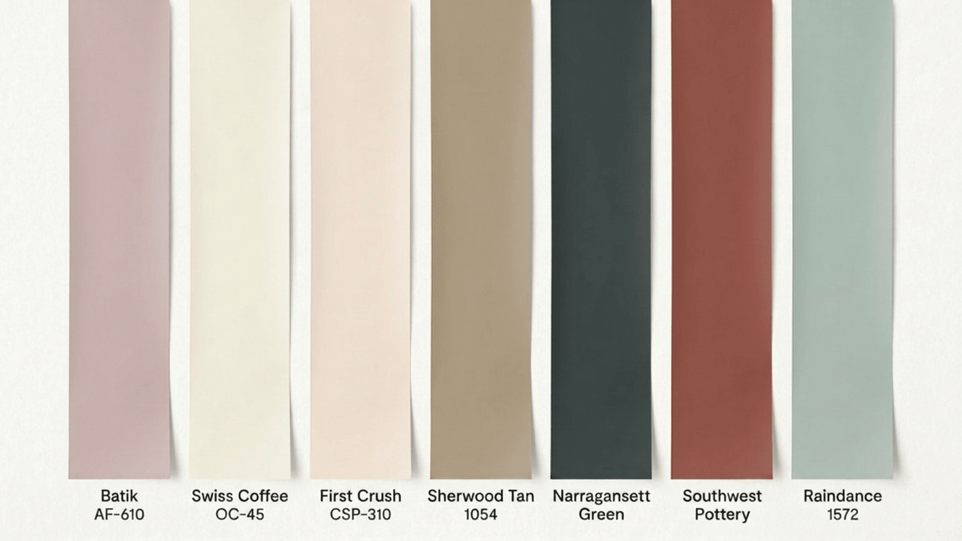
Beyond Silhouette AF-655, Benjamin Moore’s Color Trends 2026 palette includes seven supporting shades.
- First Crush CSP-310– Soft coral with pink and orange influences.
- Swiss Coffee OC-45– Creamy off-white often used on walls, trim, and ceilings.
- Raindance 1572– Blend of blue and green that resembles the color of sea glass.
- Batik AF-610– Muted blue with gray influences that keep it from feeling too bright.
- Narragansett Green HC-157– Dark green inspired by forest and evergreen tones.
- Southwest Pottery 048– Warm terracotta that resembles natural clay and sunbaked earth.
- Sherwood Tan 1054– Light brown neutral with a warm, sandy appearance.
What I like about this palette is the variety. It combines warm neutrals, earthy colors, and cooler shades without feeling disconnected.
Is Silhouette AF-655 the Right Paint Color for Your Home?
Yes, Silhouette AF-655 is likely to appeal to you if you want more depth than a traditional beige, greige, or light gray can provide.
It will work particularly well in your home that already includes natural wood, stone surfaces, brass finishes, or layered neutral palettes.
From a color-planning perspective, I would recommend sampling it before committing to large wall areas. Like many darker colors, its appearance can change significantly depending on lighting, surrounding materials, and room size.
Frequently Asked Questions
Are Warm Browns Replacing Cool Grays?
Not entirely, but warm browns are gaining popularity as homeowners look for colors that add more warmth and depth than traditional cool grays.
Who Will Love Silhouette AF-655 the Most?
Silhouette AF-655 may appeal to homeowners who prefer darker neutrals, natural materials, and spaces with stronger contrast and visual interest.
Is Silhouette AF-655 Too Dark for Small Rooms?
Not necessarily. When paired with good lighting and lighter finishes, darker colors can make small spaces feel intentional and inviting.
Can Silhouette AF-655 be Used on Cabinets?
Yes. Its depth makes it well-suited for kitchen cabinets, built-ins, and islands, especially when paired with lighter countertops and hardware.
What Are the Psychological Effects of Silhouette AF-655?
While color perception varies, research suggests color preferences can be linked to emotional states. Because Silhouette AF-655 is a deep neutral, some people may find it calming and comforting, while others may respond differently based on personal preferences.