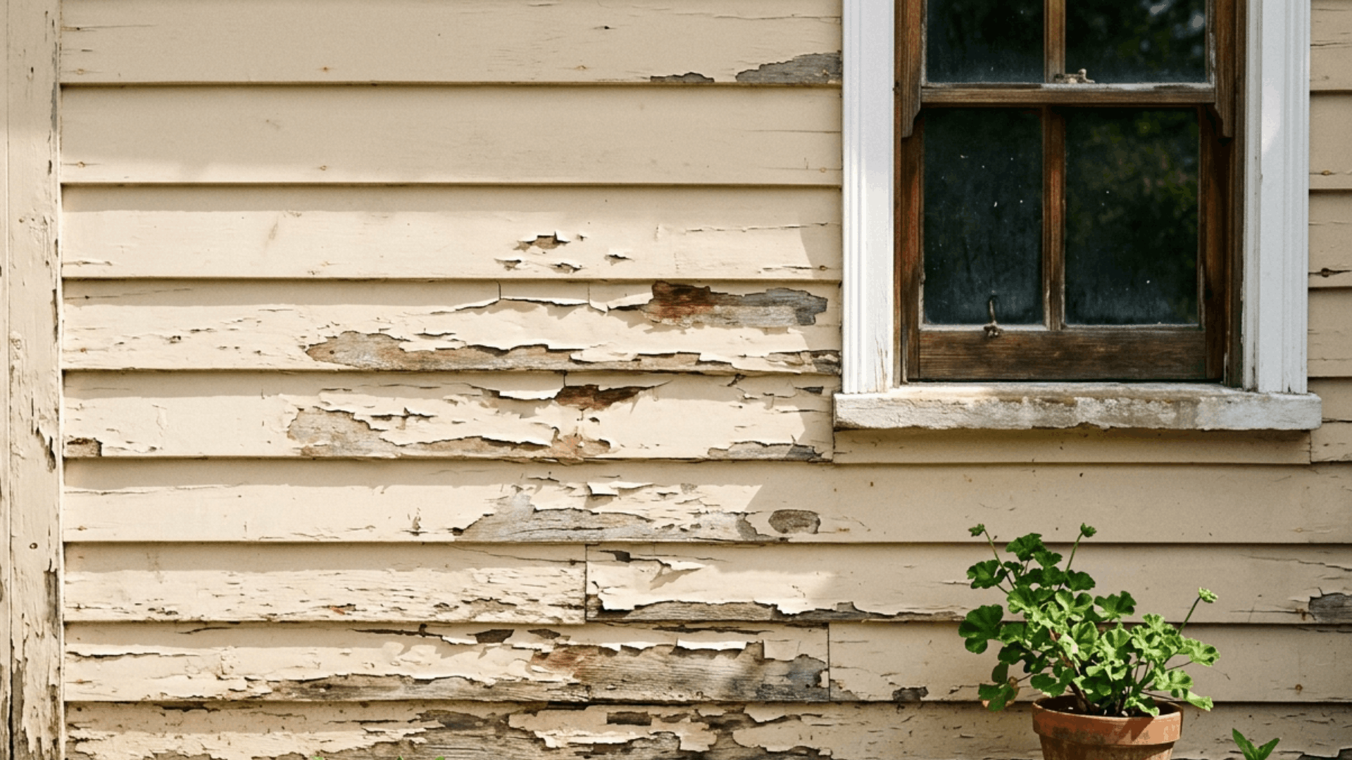
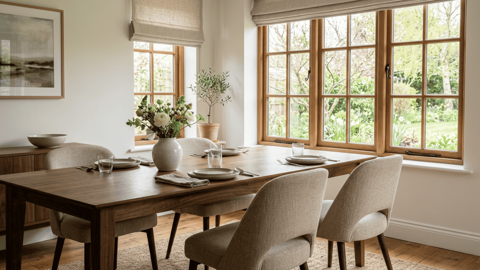
I painted my dining room three times before I got it right. The first two colors looked great on the little paint chips, but wrong on the actual walls. Maybe you have stood in that same spot, holding a sample and feeling unsure.
Color does more than fill a wall. It sets the mood for every meal, from quiet morning coffee to long dinners with family. The right shade can make a small room feel open, or a large one feel warm.
That is why I put this guide together. I will walk you through the best dining room colors and show you how each one works with light, furniture, and the feeling you want to create.
You will also learn which shades are easy to live with and which ones to skip. By the end, picking your color will feel a lot less stressful.
How to Choose the Right Dining Room Color
The right shade depends on your light, your space, and how you use the room. A few simple checks make the choice much easier.
- Test the Light First: Paint a large sample on the wall and watch it change through the day. Morning, noon, and evening light can make the same color look completely different.
- Match the Room Size: Light shades open up small dining rooms, while deep tones add coziness to large ones. Pick a color that works with the space you already have.
- Look at Your Furniture: Your table, chairs, and floors set the base tones. Choose a wall color that complements those pieces rather than clashing with them.
- Think About Mood: Decide if you want calm, energy, or warmth at the table. The best dining room colors should match the feeling you want during meals.
- Check Connected Rooms: Make sure your color flows with nearby spaces you can see from the table. Clashing tones between rooms can make a home feel choppy.
- Stick to a Simple Palette: Limit yourself to two or three main colors for walls, trim, and accents. Too many tones can make even a nice room feel busy.
Best Dining Room Colors to Try
Each color brings its own mood to the table. Pick the one that fits your light, your space, and the feeling you want at every meal.
1. Warm Greige
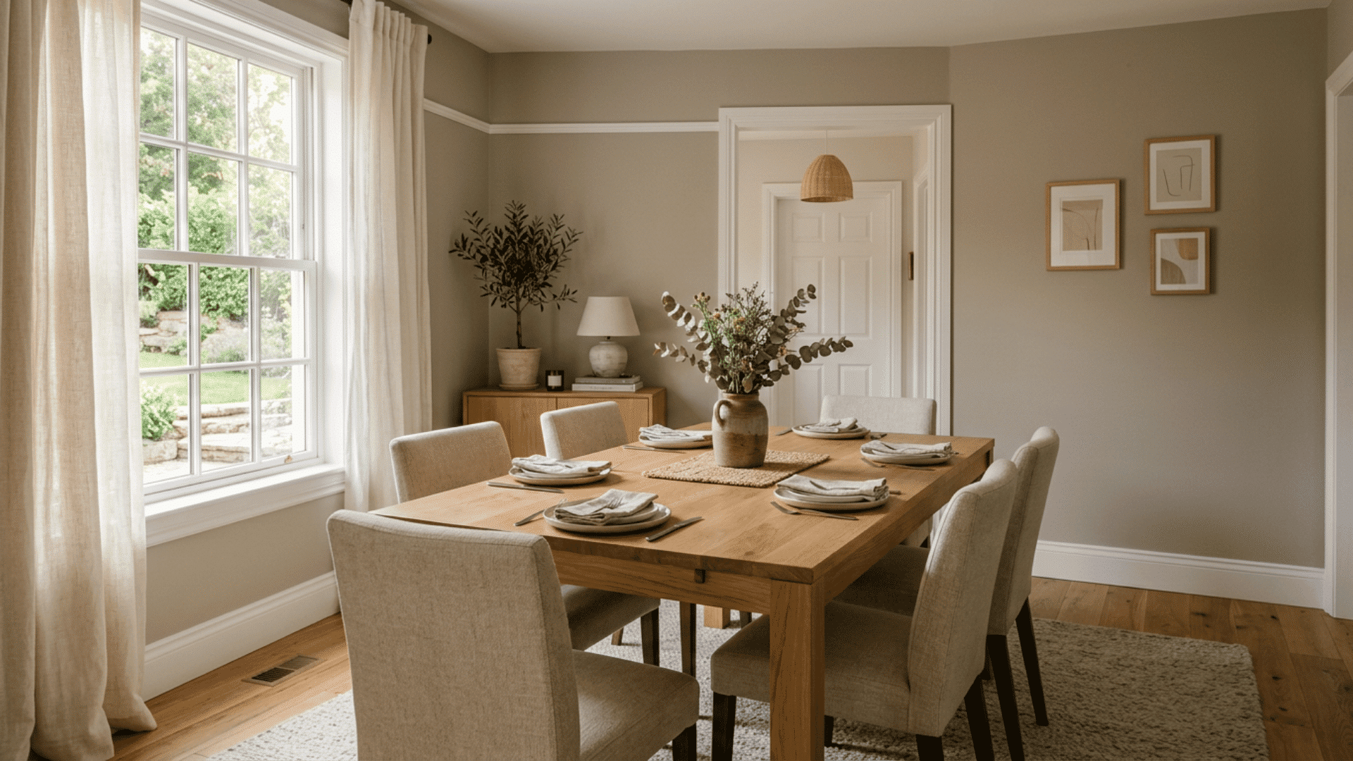
Greige sits right between gray and beige, which makes it one of the most flexible best dining room colors you can choose. I painted my own dining room this shade after months of going back and forth, and it surprised me.
The walls look soft brown in morning light and cooler gray by evening. That shift kept the room from ever feeling flat. It pairs well with wood tables, white trim, and almost any chair color.
If you want a safe pick that still feels current, greige rarely lets you down.
2. Deep Navy Blue
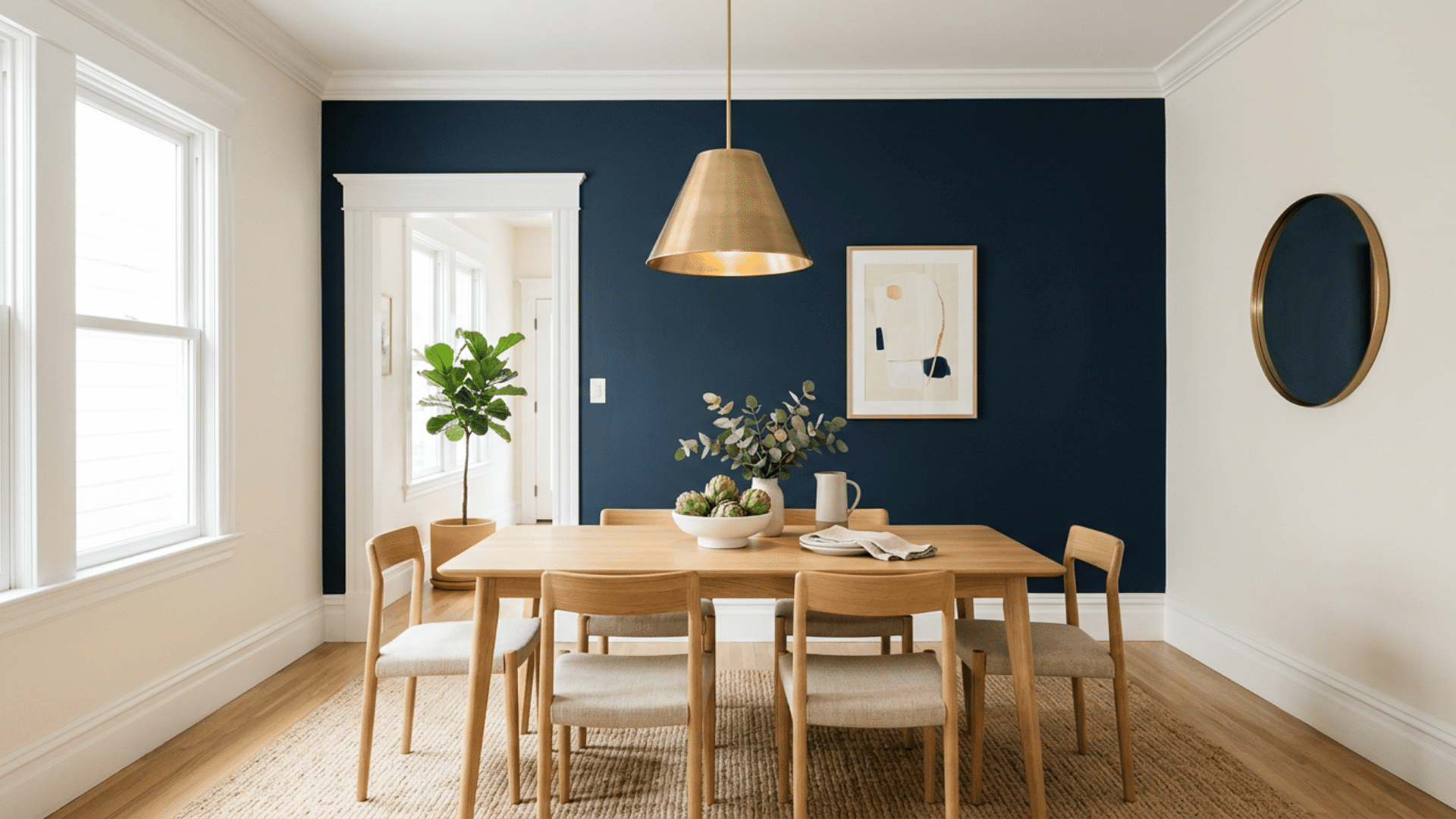
Imagine a dining room that feels calm but never boring. That is what the Navy does. This is a color for people who want their walls to make a quiet statement without shouting for attention.
Navy works best in rooms with good natural light, since it can feel heavy in dark spaces. Pair it with brass light fixtures, light wood, or crisp white molding to keep things balanced.
The contrast makes the whole room look pulled together.
Tip: Use navy on a single accent wall first if a full room feels like too much.
3. Soft Sage Green
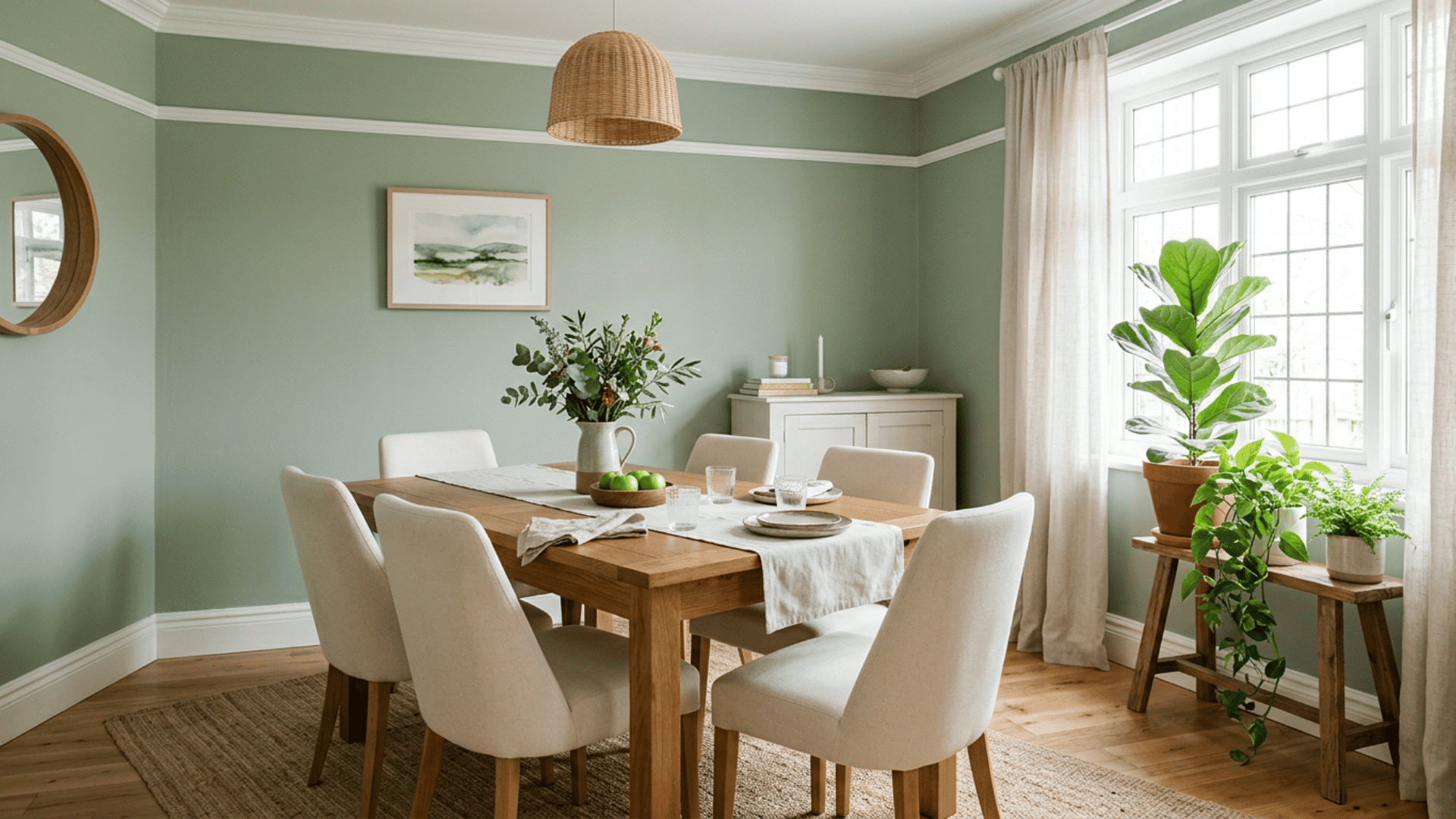
Sage green has quietly become a favorite, and it is easy to see why. My friend painted her dining room sage last spring, and walking in felt like stepping into a slow, restful afternoon.
The green ties the indoors to the garden just outside her window. It is gentle on the eyes and works in both modern and farmhouse homes.
Sage also flatters food and skin tones, so your meals and your guests both look better. For a fresh, grounded look, this shade is hard to beat.
4. Classic Warm White
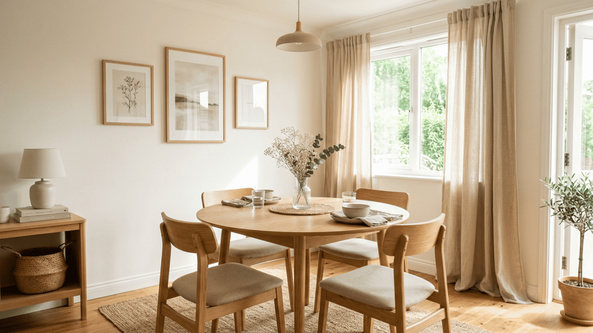
Not every room needs a bold color to feel finished. Warm white keeps things open, bright, and flexible for years to come.
This shade reflects light, which makes small dining rooms feel larger. It also lets your furniture, art, and table settings take center stage.
Choose a white with warm undertones, like a hint of cream, so the room feels cozy instead of cold or sterile.
- Best for small or low-light rooms
- Easy to repaint or restyle later
- Pairs with any decor style
5. Terracotta Clay
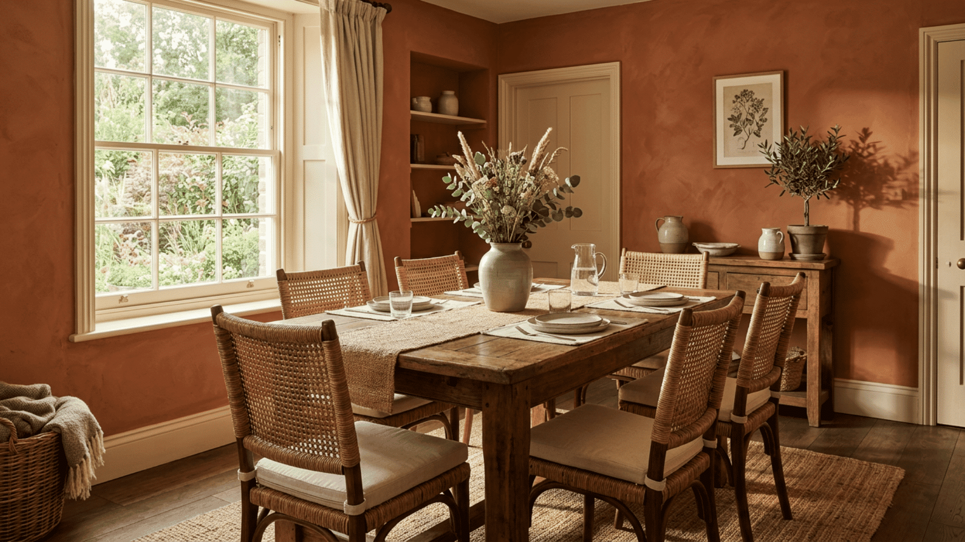
Terracotta brings the warmth of sun-baked earth right into your home. It is bold without being loud, and it makes a dining room feel rich and welcoming.
This shade pulls from clay pots, desert sunsets, and old Mediterranean kitchens. It pairs beautifully with cream walls, natural wood, and woven textures.
Terracotta works best in rooms that get warm afternoon light, since it deepens and glows as the day goes on. If you want a color full of life that still feels cozy at dinner, this earthy tone delivers every single time.
6. Charcoal Gray
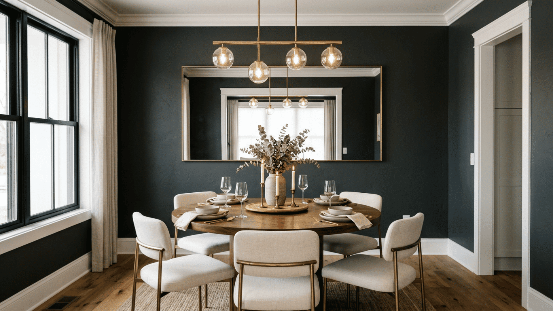
Want drama without going all black? Charcoal is your answer. It feels modern, moody, and surprisingly easy to style around.
This deep gray hides scuffs and fingerprints well, which helps in busy homes. Use it with warm wood tones and soft lighting so the room stays inviting instead of cold. White or brass accents keep the look sharp and break up the darkness.
Tip: Charcoal pairs well with large mirrors that bounce light back into the space.
7. Mustard Yellow
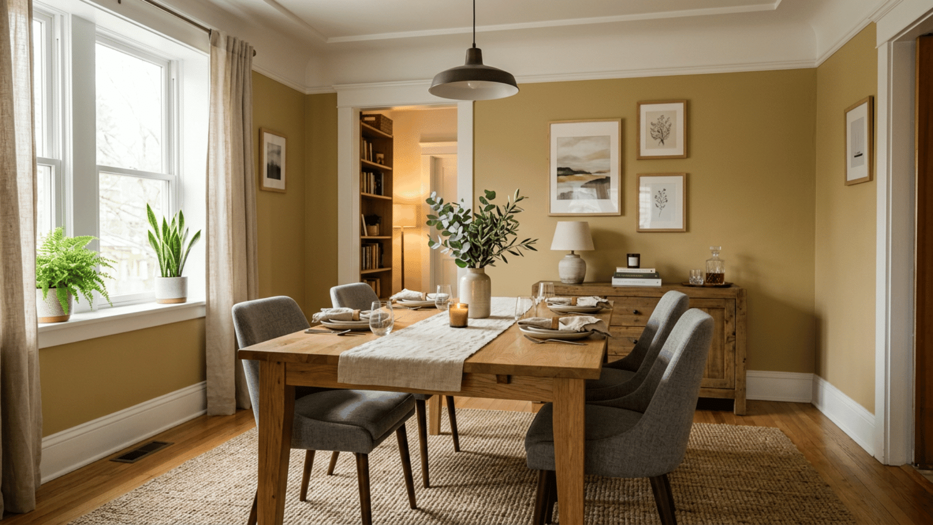
Mustard yellow caught my eye at a small cafe last year, and I could not stop thinking about it. The walls were a deep golden tone that made the whole room feel happy and full of energy.
This shade adds warmth and personality without feeling childish. It works well with gray, navy, or natural wood. Mustard is a great pick if your dining room feels dull and you want something with real character and a bit of retro charm.
8. Dusty Rose
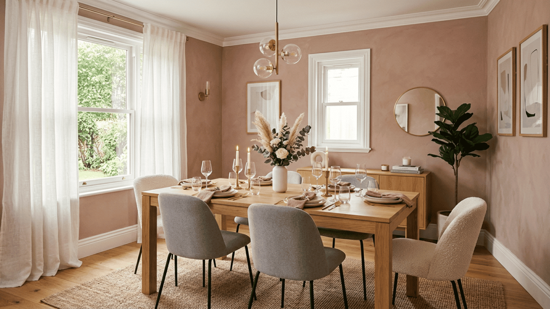
Soft, calm, and a little unexpected, dusty rose adds a gentle touch to any dining space. It feels warm without being too sweet.
This muted pink reads as a neutral in many rooms, which makes it easier to use than people think. Pair it with gray, white, or deep green to keep it grounded and grown-up. The result is a space that feels soft and stylish at the same time.
- Works in both modern and vintage homes
- Flatters warm and cool lighting
- Pairs well with brass or black accents
9. Forest Green

Few colors feel as grounded as forest green. It brings the calm of the outdoors inside and makes a dining room feel rich and full. This deep shade works well in homes that want a cozy, library-like mood.
Pair it with wood floors, warm lighting, and gold or brass accents for a classic look. Forest green also hides marks well, which helps in rooms that see daily use.
If you love bold color but want something timeless, this shade gives you depth without ever feeling trendy.
10. Creamy Beige

Sometimes the simplest choice is the smartest one. Creamy beige keeps your dining room soft, warm, and easy to live with for years.
This shade gives you a gentle backdrop that works with nearly any furniture or decor. It feels cozier than plain white and brighter than darker tones.
Add texture through rugs, wood, and fabric so the room still feels full of depth and interest.
- Great for renters and resale
- Hides minor wall flaws well
- Pairs with any accent color
11. Slate Blue

Slate blue lands somewhere between gray and blue, giving you calm with just a hint of color. It feels steady and easy on the eyes. This shade suits people who want something soft but not boring.
It works in both cool and warm light, shifting slightly through the day. Pair it with white trim, light wood, and simple metal accents for a clean, settled look.
Slate blue is a smart pick for a dining room where you want to feel at peace, especially during slow weekend meals when you linger a little longer at the table.
12. Burnt Orange
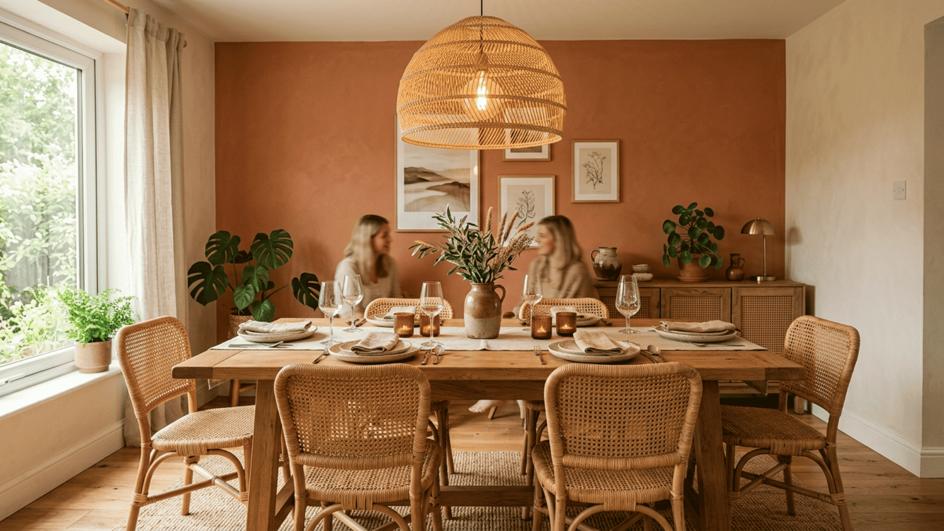
Looking for energy at the table? Burnt orange brings warmth and a bit of boldness without tipping into bright neon territory.
This shade feels cozy in fall and welcoming year-round. Use it on one wall or across the whole room, paired with cream, brown, or deep green to balance the heat.
Soft lighting helps it glow rather than overpowering it.
Tip: Burnt orange looks great with rattan chairs and woven light fixtures.
13. Soft Lavender
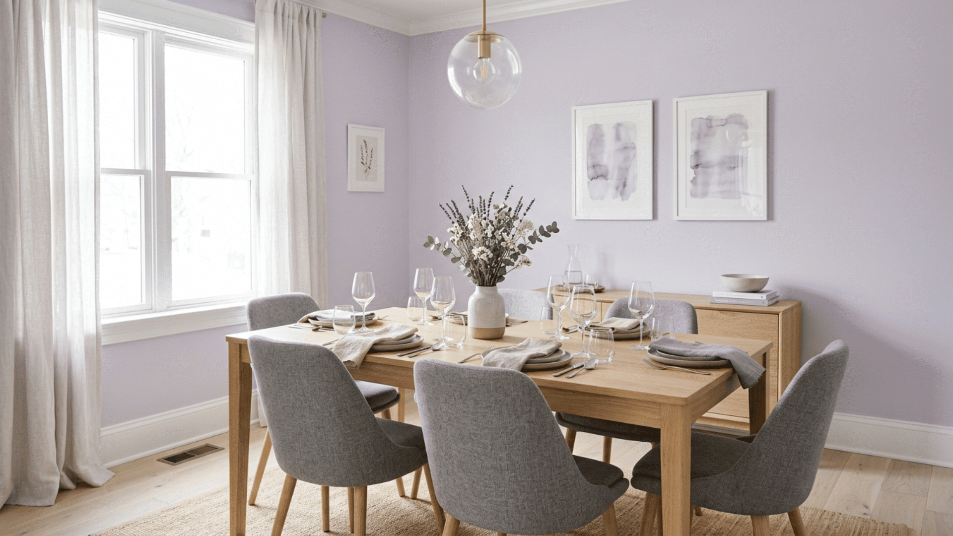
I almost skipped lavender, thinking it would feel too sweet, until I saw it in a friend’s dining room. The walls were a pale, dusty purple that felt calm and grown-up, not childish at all.
It softened the whole space and made dinners feel relaxed. Lavender works best with white trim, gray accents, and plenty of natural light.
It is a gentle, unexpected choice that adds a quiet bit of personality. If you want something different but still soothing, this shade is worth a real look.
14. Olive Green
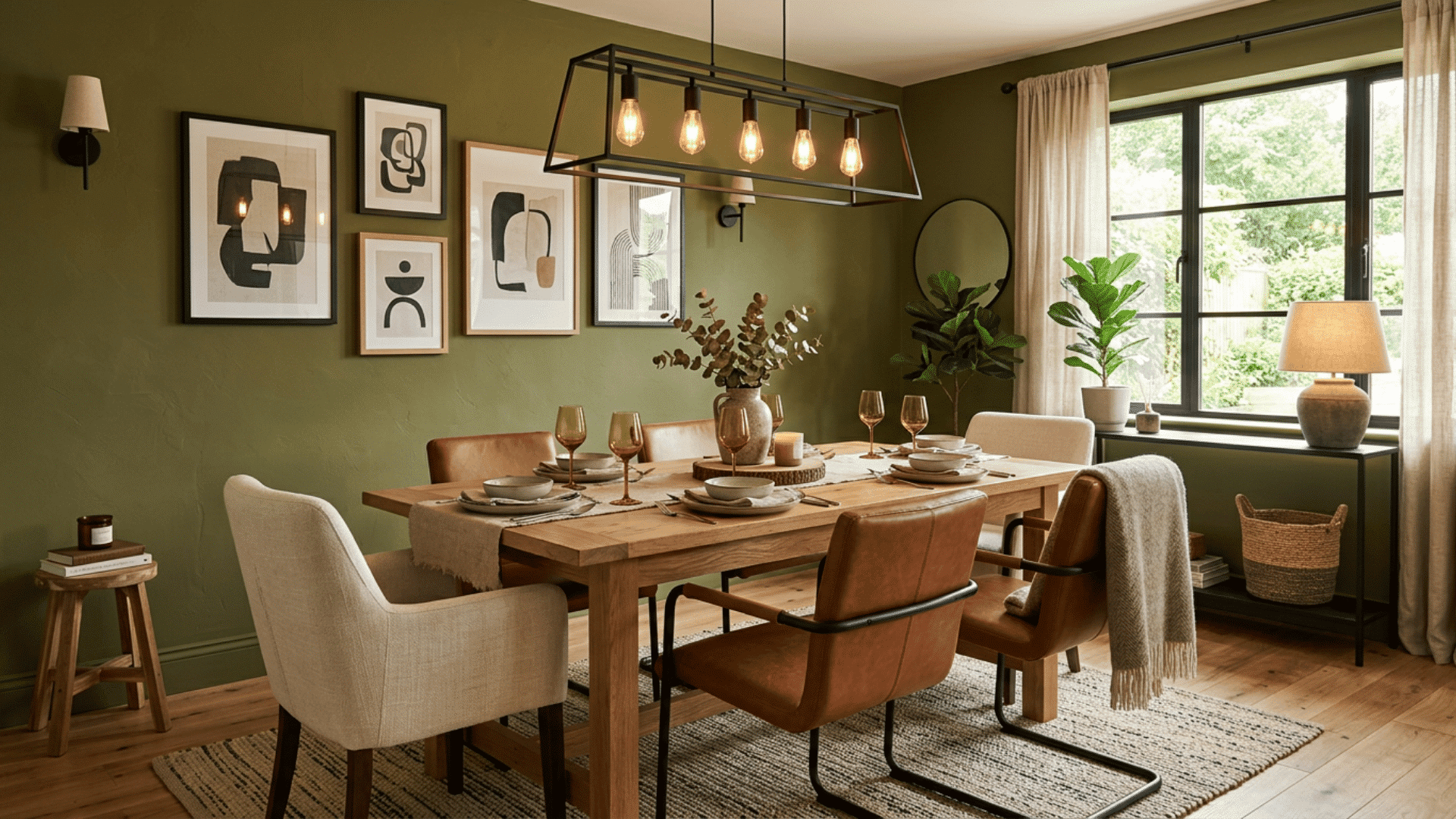
Olive green feels earthy, warm, and a little vintage all at once. It brings a grounded, lived-in mood to any dining space. This muted shade pairs well with wood, leather, and cream tones for a cozy, natural look.
It works in both modern and rustic homes and hides daily wear well. Olive sits comfortably in low and bright light, staying rich either way.
For a color that feels relaxed and full of character without trying too hard, olive green is a strong choice that ages well.
15. Pale Gray
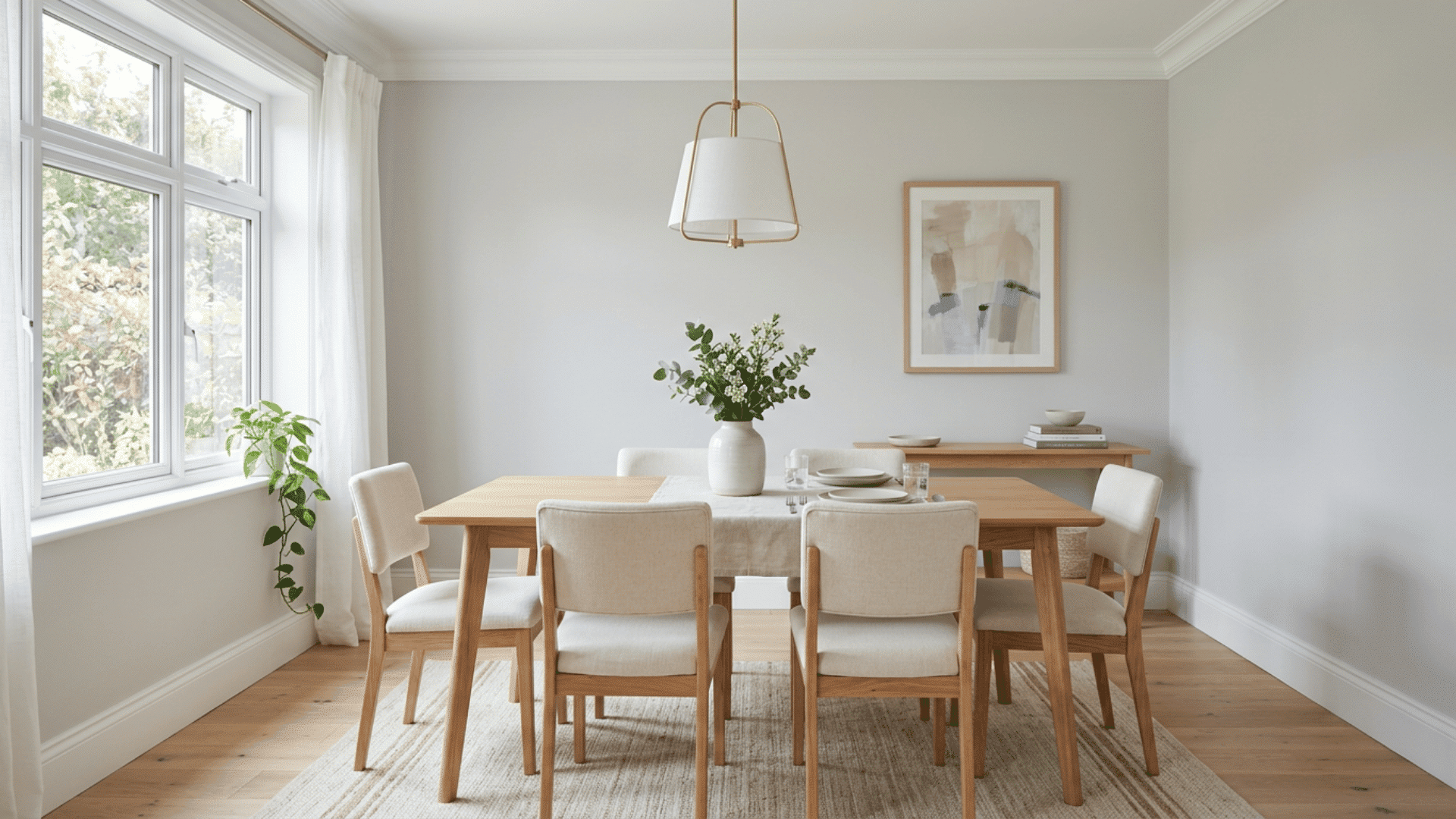
When in doubt, pale gray keeps things light, clean, and flexible. It gives you a calm base that almost any style can build on.
This soft neutral brightens a room without the starkness of pure white. It pairs easily with bold furniture, art, or a colorful rug, letting those pieces shine. Choose a gray with warm undertones so the space feels cozy rather than cold or flat.
- Ideal for small or shared spaces
- Works with any accent color
- Easy to restyle as trends change
16. Rich Plum
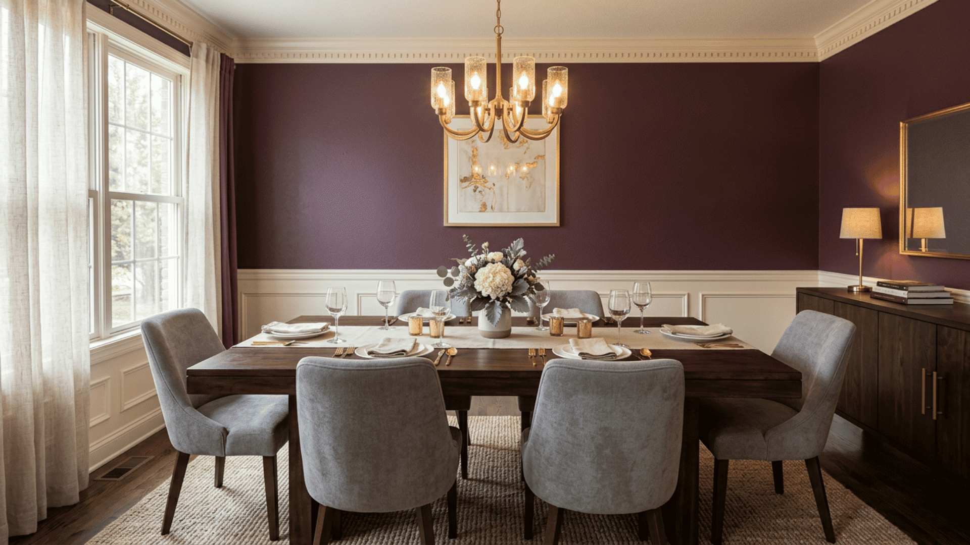
Plum brings a deep, jewel-toned warmth that feels both bold and cozy. It adds personality to a dining room without going fully dark.
This shade works well in spaces meant for evening meals and gatherings, since it glows under soft, warm light. Pair it with cream, gold, or gray to keep the look balanced and grown-up.
Plum suits homes that want a touch of luxury but still feel welcoming. If you love color and want your dining room to feel special, this rich purple delivers depth and charm in equal measure.
17. Warm Taupe
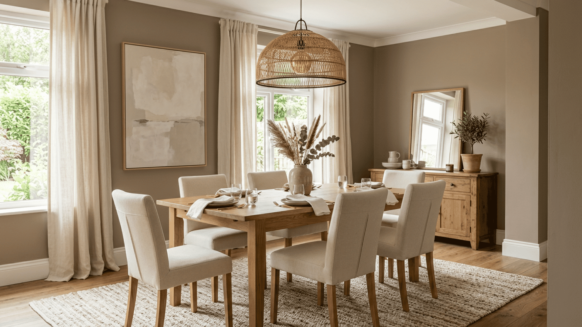
Need a neutral with a little more depth? Warm taupe sits between beige and gray, giving you a soft, earthy base that never feels boring.
This shade flatters wood furniture and natural textures, making the whole room feel grounded. It works in nearly any light and pairs with both cool and warm accents.
Taupe is a great pick when you want calm walls that still have character.
Tip: Taupe makes a great backdrop for bold art or a statement light fixture.
18. Sky Blue
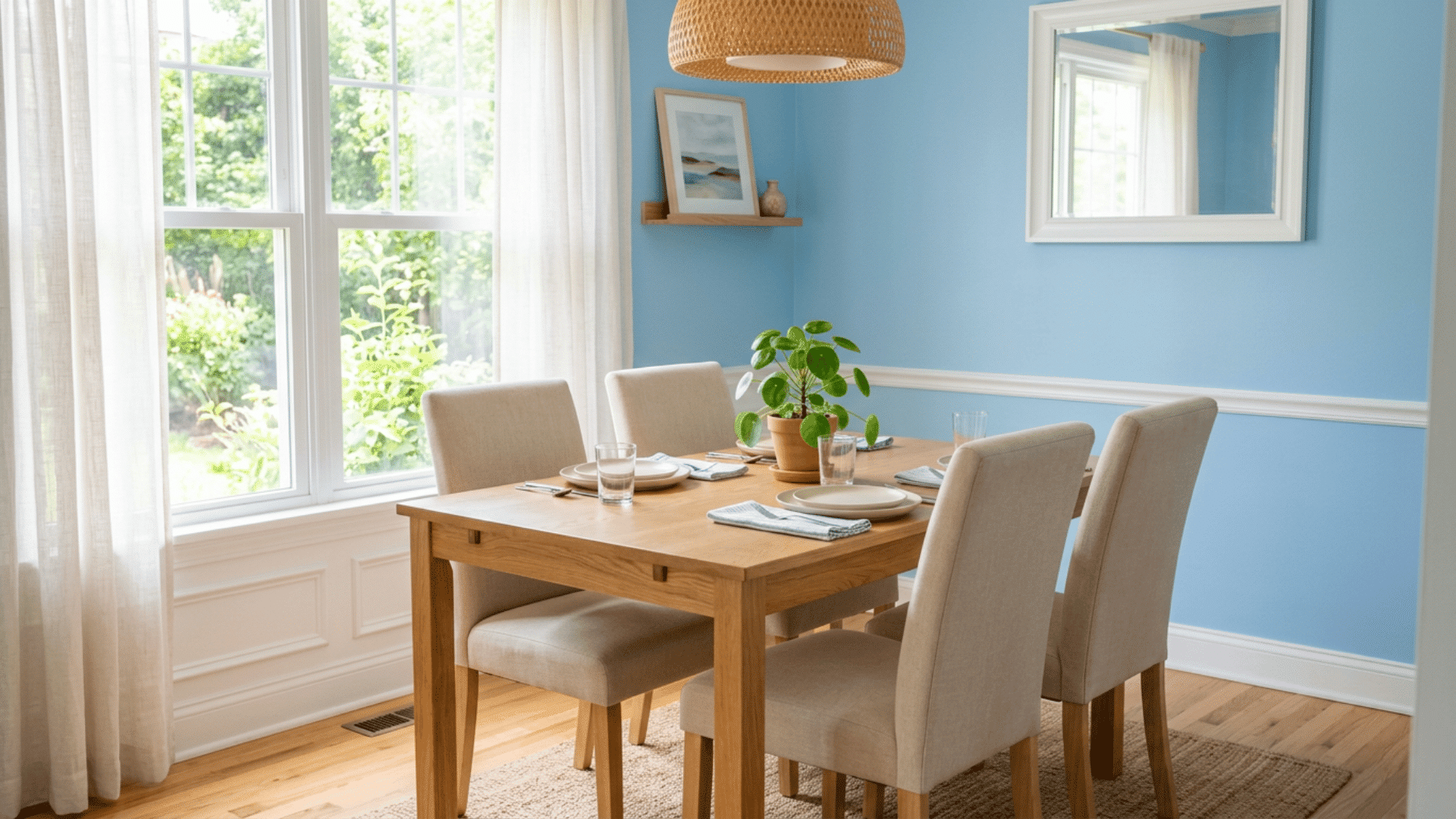
I painted a small breakfast nook sky blue years ago, and it still makes me smile when I think about it. The pale, airy tone made the tight space feel open and bright, almost like sitting outside.
Mornings there felt fresh and easy. Sky blue works best in rooms with good natural light, paired with white trim and light wood. It is cheerful without being loud.
If your dining room feels cramped or dull, this soft blue can lift it in a simple, lasting way.
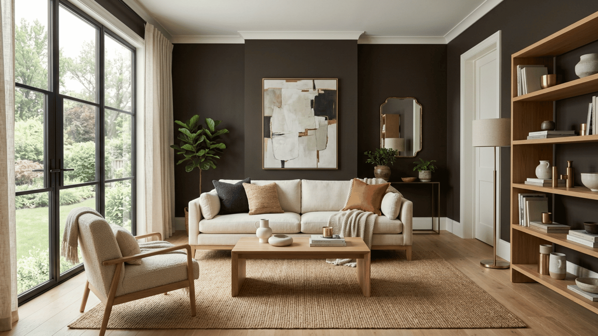
19. Chocolate Brown
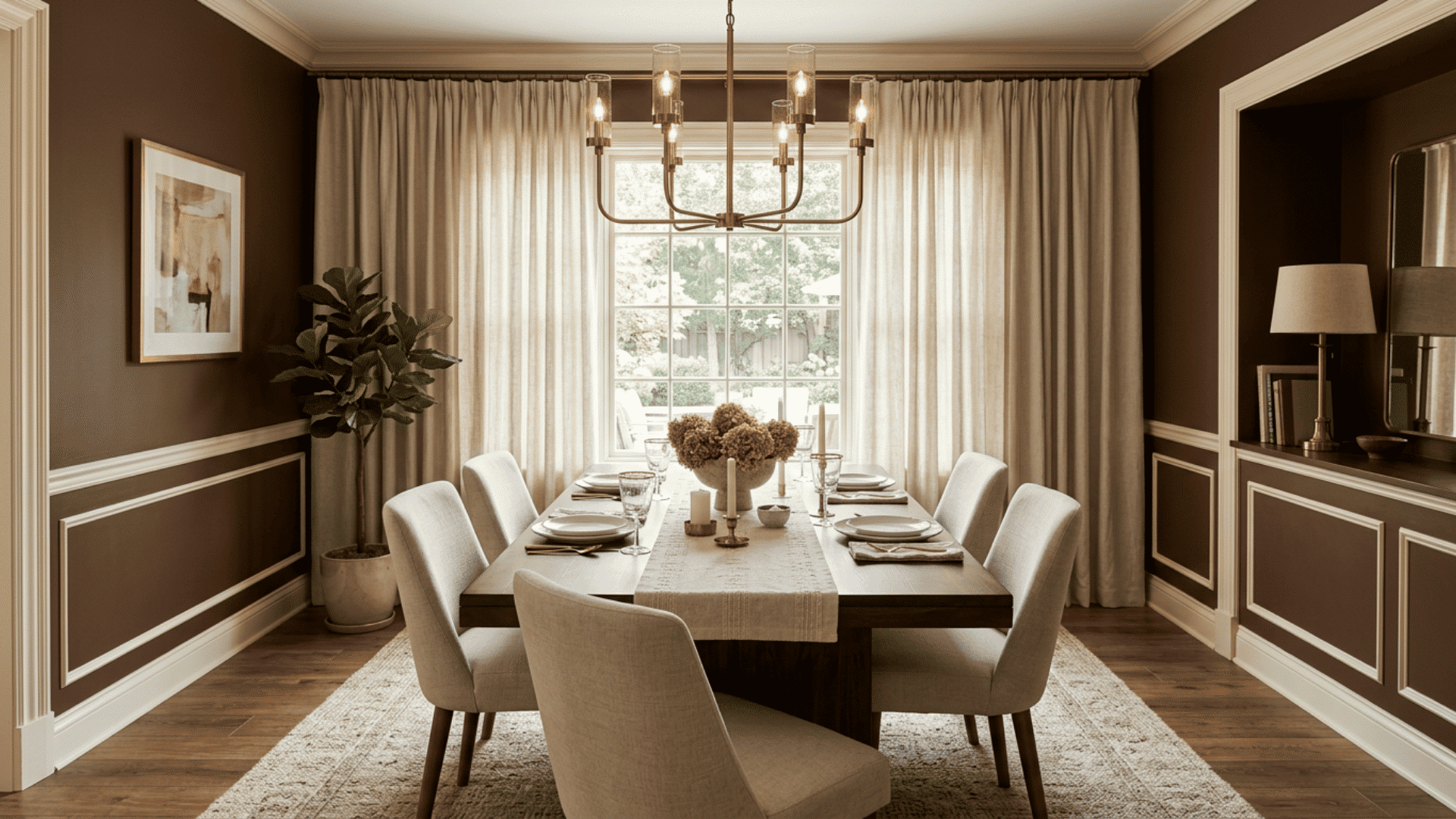
Chocolate brown wraps a dining room in warmth and feels rich, cozy, and grounded. It is a bold choice that still reads as comforting.
This deep shade works well with cream accents, brass lighting, and plenty of texture to keep it from feeling heavy. It suits larger rooms or spaces with good light, where the depth can shine.
Brown also hides marks well, which helps in busy homes. For a dining room that feels like a warm hug at the end of the day, this earthy tone is hard to top.
20. Pale Yellow
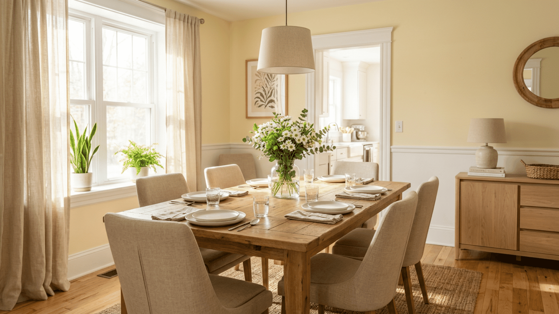
Soft, sunny, and full of cheer, pale yellow brings a gentle lift to any dining space. It feels bright without being too bold.
This light shade makes a room feel warm and welcoming, even on gray days. Pair it with white trim, natural wood, and simple decor so it stays fresh rather than busy. It works especially well in rooms that get morning light.
- Great for small or north-facing rooms
- Pairs with gray, white, or navy accents
- Feels cheerful all year round
21. Muted Teal
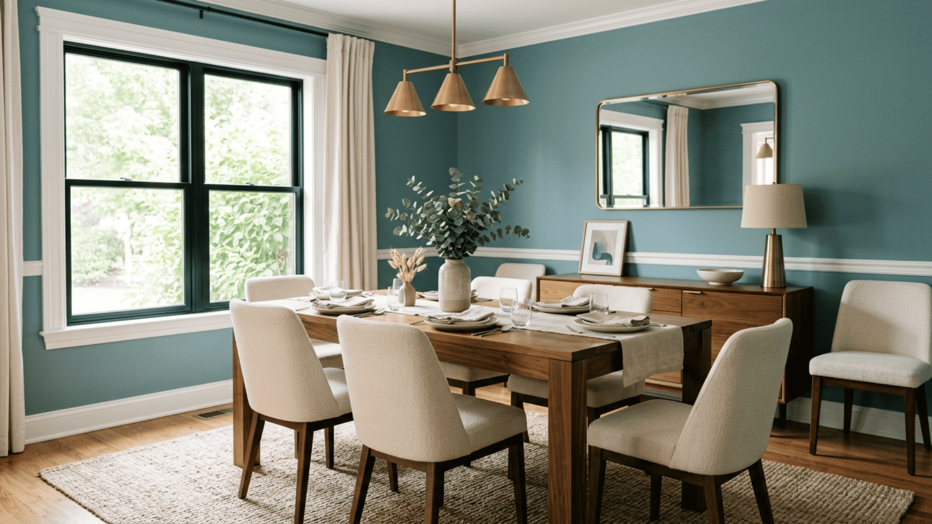
Teal blends blue and green into one calm, refreshing shade that feels both modern and timeless. It adds color without overwhelming the room.
This tone works well in dining spaces that need a little personality but should still feel relaxing. Pair it with white trim, warm wood, and gold or brass accents to keep the look balanced.
Muted teal suits rooms with decent light, where its depth can really show. If you want a color that feels calm yet interesting, this blue-green mix gives your dining room a fresh, settled mood.
22. Soft Peach
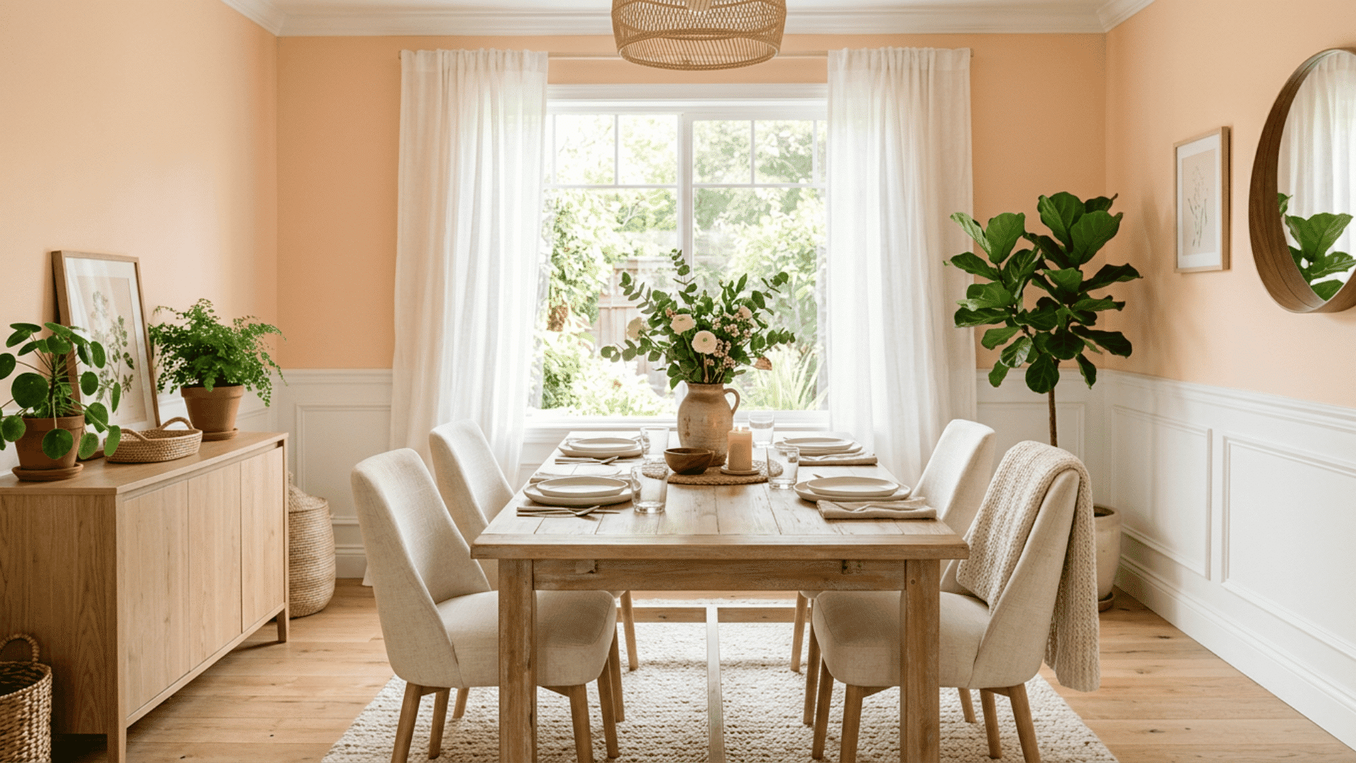
Want a color that feels warm and welcoming the second you walk in? Soft peach brings a gentle glow that makes meals feel cozy and bright.
This light, fruity shade flatters skin tones and food, so your guests and your table both look their best. Pair it with white, cream, or light wood to keep it fresh and grown-up.
Peach works well in rooms with soft, natural light.
Tip: Peach pairs nicely with green plants for a fresh, garden-like feel.
23. Deep Burgundy
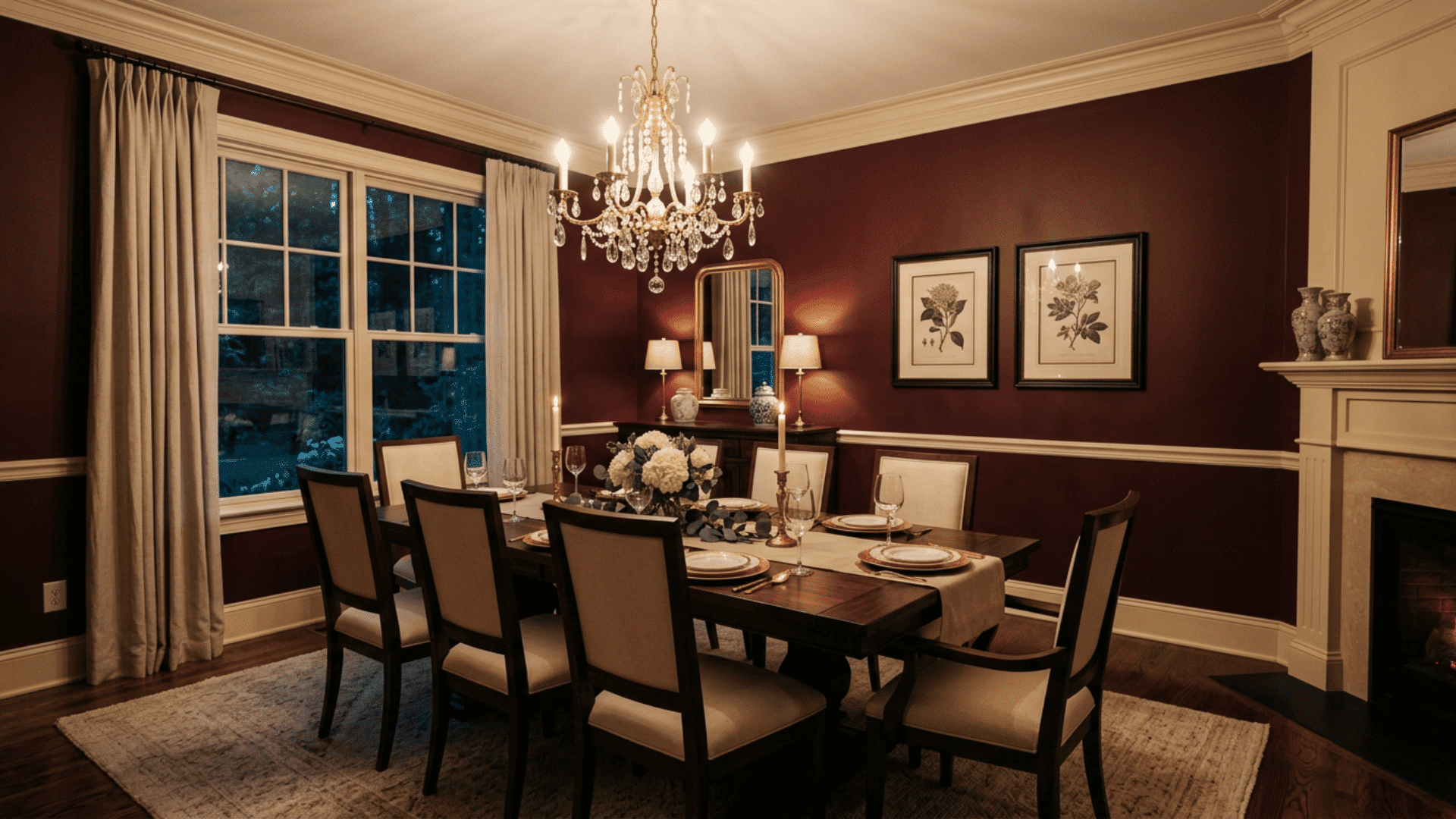
My aunt painted her dining room burgundy, and I remember thinking it would feel dark, but it ended up feeling the opposite. The rich red walls made holiday dinners feel warm and special, almost as if the room were built for gathering.
It glowed under the chandelier. Burgundy works best with cream trim, gold accents, and warm lighting to balance the depth. It suits homes that host often and want a bold, inviting mood.
If you love color and drama done right, this deep red is a memorable choice.
24. Light Mint
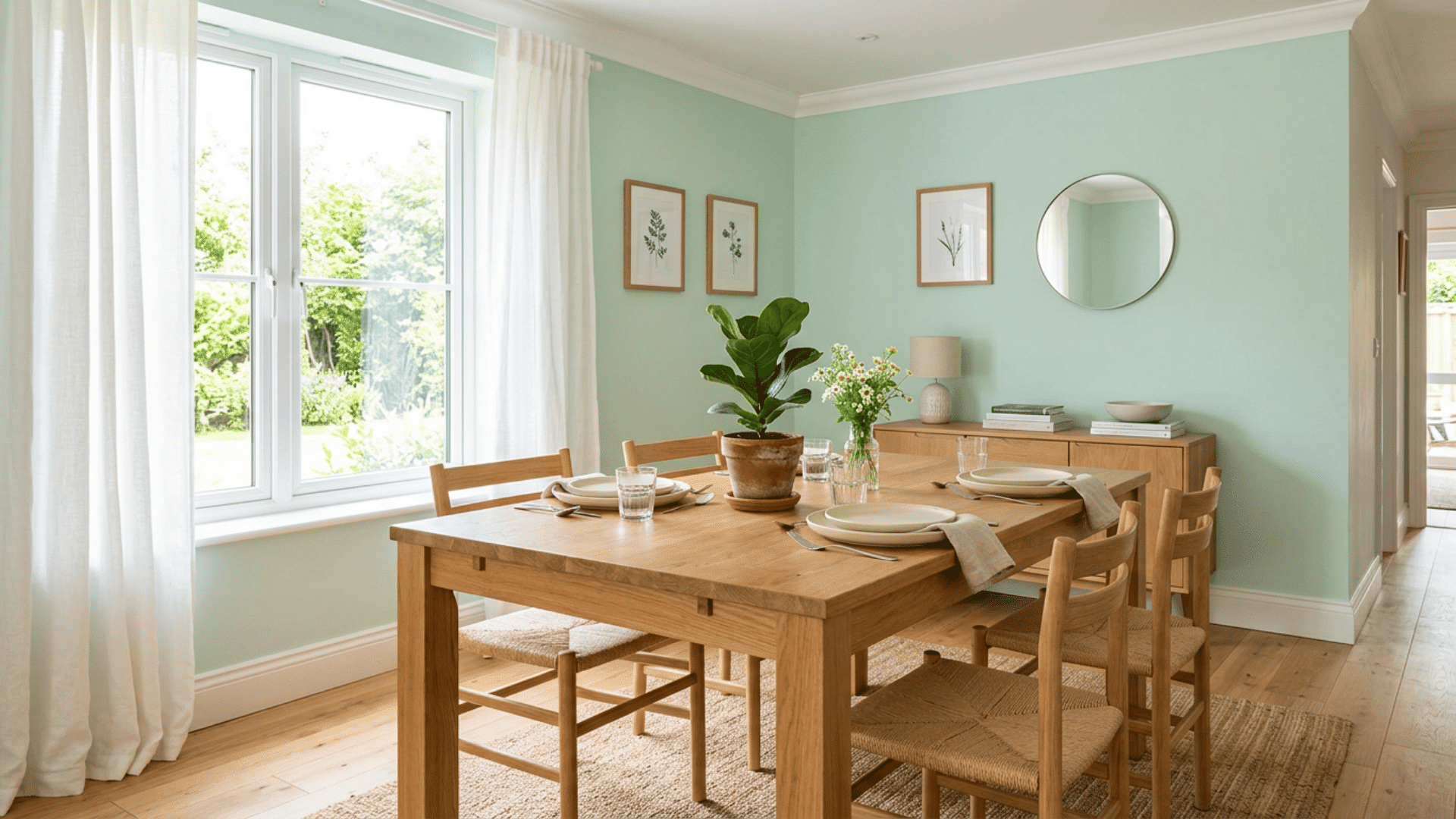
Light mint adds a soft, fresh touch that feels clean and calm. It is a gentle way to bring color into a dining room without going bold. This airy green-blue shade brightens a space and pairs well with white trim and natural wood.
It works nicely in smaller rooms, where it keeps things feeling open and crisp. Mint flatters both modern and vintage decor, making it easy to style around.
For a dining room that feels light, cheerful, and a little unexpected, this soft shade is a refreshing and easy choice.
25. Stone Gray
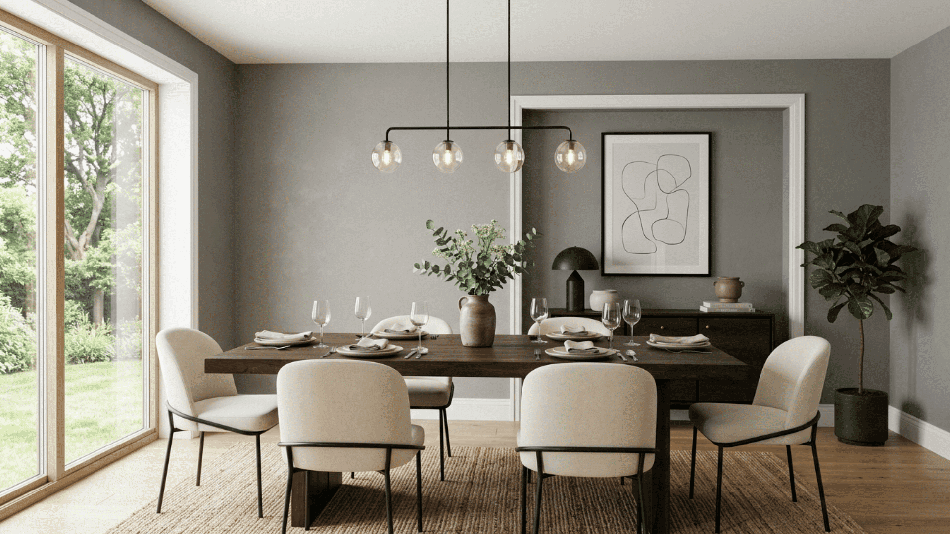
Looking for a neutral that feels solid and grown-up? Stone gray gives you a steady, earthy base that works with almost any style.
This shade leans warmer than cool grays, so the room feels grounded rather than chilly. Pair it with wood, cream, or black accents for a clean, balanced look. Stone gray hides daily wear well, which makes it practical for busy dining rooms.
- Works in both bright and low light
- Pairs with warm or cool accents
- Easy to restyle over time
Dining Room Color Combinations that Work Well
Pairing the right shades makes a space feel cohesive and calm. The combos below balance walls, trim, and accents with ease.
| Main Color | Pair With | Accent | Mood | Best For |
| Greige | Crisp White | Black | Calm, modern | Most homes |
| Navy Blue | Warm White | Brass | Bold, classic | Bright rooms |
| Sage Green | Cream | Natural Wood | Fresh, restful | Farmhouse styles |
| Charcoal Gray | Light Wood | Gold | Moody, sleek | Busy households |
| Terracotta | Soft Cream | Woven Texture | Warm, earthy | Sunny spaces |
| Forest Green | Tan | Brass | Rich, cozy | Library-like rooms |
| Warm White | Beige | Greenery | Light, airy | Small rooms |
| Plum | Gray | Gold | Luxe, welcoming | Evening dining |
When picking dining room color combinations that work well, keep one shade dominant and let the others support it.
If you prefer rich, darker shades, Benjamin Moore’s color of the year 2026 is another great place to look, especially if you want a warm, grounded, and stylish deep brown tone.
Mistakes to Avoid When Choosing Dining Room Colors
A few common slip-ups can throw off even a great color choice. Knowing them ahead of time saves you money and frustration.
1. Skipping the Sample Step
The biggest mistake people make when choosing dining room colors is trusting the tiny paint chip in the store. That little square almost never matches how the color looks on a full wall.
The lighting in a shop is nothing like the light at home. Buy a sample pot, paint a big patch, and live with it for a few days. Watch how it shifts from morning to night.
This small step takes time, but it prevents you from repainting an entire room you do not love.
2. Ignoring the Lighting
Light changes everything. A color that looks soft and warm in a bright showroom can turn dull or cold once it hits your walls.
Natural light, bulb type, and even nearby wall colors all shift how a shade reads. North-facing rooms tend to be cooler, while south-facing rooms tend to be warmer. Always test your color in the actual room before you commit.
Tip: Try warm white bulbs to keep deep colors from looking gray or muddy at night.
3. Going Too Bold Too Fast
It is easy to fall for a daring color online and want it on every wall right away. Slow down. Bold shades like deep red or bright teal can feel amazing in small doses but overwhelming across a whole room.
Start with one accent wall or bring the color in through chairs and decor. Test how it feels day-to-day. You can always add more later.
Pulling back is much harder once the paint is dry, so ease into strong colors instead of diving in all at once.
4. Forgetting the Whole Home Flow
Your dining room does not exist on its own. If you can see the kitchen or living room from the table, those colors need to get along.
Clashing tones between connected spaces make a home feel choppy and unplanned. Pull a shade from a nearby room, or stick to a single shared undertone to tie things together.
- Match undertones, not exact colors
- Use trim color to connect rooms
- Walk through your home before deciding
5. Choosing Color Before Furniture
Imagine buying the perfect paint, then bringing home a table that fights with it. That happens more often than you would think. Your furniture, floors, and big decor pieces carry their own tones, and the wall color should support them.
If you plan to keep your current table, build the palette around it. If new pieces are coming, wait until you see them in the room. Color is easy to change, but furniture is a bigger commitment, so let it lead the way.
Final Thoughts
Picking a paint color can feel like a lot of pressure, but it does not have to be. The truth is, there is no single right answer. The best shade is the one that fits your light, your style, and the way you actually live in your space.
Start small. Grab a sample, paint a patch, and let it sit for a few days before you decide. Trust what feels good when you walk in the room.
If you lean toward calm greige, bold navy, or warm terracotta, your dining room should feel like a place you enjoy gathering.
Which color are you leaning toward, or which one did you end up choosing? Share your experience in the comments below.
Frequently Asked Questions
Should the Dining Room Match the Kitchen or Living Room?
The dining room doesn’t need to match the kitchen or living room, but should coordinate with them.
What Color is Replacing Gray in 2026?
Warm neutrals like beige/taupe/cream and cream, as well as earth tones (especially mushroom neutrals), are replacing gray in 2026.
What are the Dining Room Trends for 2026?
2026 dining room trends include closed-concept layouts, bold sculptural lighting, rich colors (chocolate brown, soft charcoal, muted greens), textured walls, and wood-clad designs.