
Do you find yourself amazed by the charm of Sherwin-Williams Sea Salt? But could not find a practical guide to this beautiful paint color. Then you have come to the right place. You are not alone in struggling to find detailed information about Sea Salt.
Sherwin Williams Sea Salt is a popular choice of paint for coloring home interior and exterior. Many prefer this shade to create a calm and soothing effect. The color has a mild, pleasant, and homely vibe.
The paint has undertones that make it harder to describe in simple words. The color is a shade of blue-grey that often appears as green-gray in different lighting. Also, it is challenging to find clear and detailed information about the paint.
Here, we will discuss everything about it, including Sea Salt by Sherwin Williams’ description, undertones, and more.
What Exactly is Sherwin Williams Sea Salt?
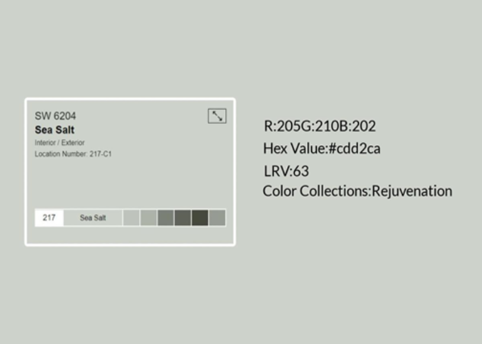
Sherwin Williams Sea Salt is a unique blue-green paint shade that looks soft and muted. It has a gray foundation that creates a light and calming environment. The tone of the paint may look more greenish in some interiors and bluish in others.
The color looks warm and greener in a warm, sunny, and bright environment. It usually appears greenish in high sunlight and warm weather.
But when the environment gets cooler and darker, the paint looks more blue than green. That is why when you search for the Sea Salt description or definition, you will always find it as a hybrid or unique combination of blue and green.
So, if you want to know what Sherwin Williams Sea Salt exactly is? The answer is pretty simple: this paint shade that displays a unique and exciting combination of blue and green with a foundation of gray. The paint color may look soft and muted or fresh depending on the environment it is exposed to.
Similar Post: A Complete Review of Sherwin Williams Modern Gray Paint Color
What Colors Will Go Perfectly with The Sea Salt?
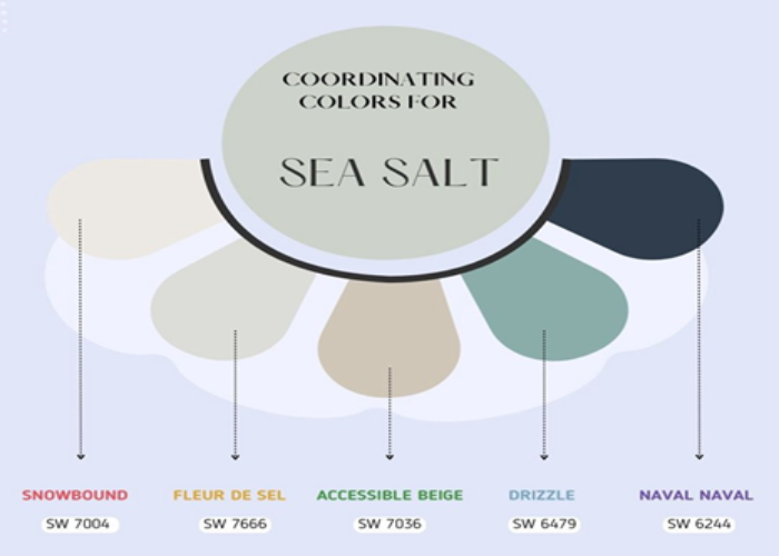
Well, you must know how to use it or what colors go perfectly with the sea salt paint. Sherwin Williams is a versatile shade that goes well with multiple colors and creates a beautiful and unique color palette.
Below, we will list some colors that look perfect with sea salt paint-
1. Snowbound – Snowbound is the most popular choice to pair with Sherwin-Williams sea salt. It can create a beautiful harmony with the color and also help to highlight beautiful undertones of sea salt paint. The color palette looks natural, soft, and fresh, ideal for minimalist and neutral interior or exterior walls.
2. Beige – Another shade that goes perfectly with the sea salt is Beige. It has a soft and light vibe that strikes a beautiful balance. The color combination is elegant and sophisticated.
3. Gray – Gray is also an excellent pairing option with Sherwin-Williams sea salt. It looks fantastic with sea salt paint and creates a calm and cozy environment.
4. Black– Sherwin Williams Sea Salt paint is a beautiful hybrid of green-blue, and you can pair it with several dark shades to create an interesting color palette for your home. The paint looks fantastic with black color and creates a beautiful contrast. The combo gives a calm and soothing vibe that complements each other.
5. Dark blue or green – Sea Salt paint also combines dark blue and green and creates a magical feel. You can get an earthy look while combining dark green and a marine vibe when pairing it with dark blue.
There are many other colors that you can pair with sea salt paint for a beautiful color scheme, like Greige, Malabar, Kilim Beize, etc.
Also Read: The Ultimate Review of Sherwin Williams Repose Gray
Explaining the True Undertones of The Sea Salt
As per this paint’s description, the paint color is a hybrid form of green and blue with a foundation of gray. Sea salt paint is often known as a chameleon of color ranging from mellow green to faded blue. The true undertone of Sherwin Williams Sea Salt is green, but the faint blue hues and gray radiant are significant.
Sea salt paint’s appearance depends on the type of light it is exposed to. So, the undertone of Sherwin Williams Sea Salt paint on bathroom walls will differ from the sea salt paint on the living room or outdoor patio walls, where it can get high natural light.
When you keep the paint in a low-light area, the blue undertones will get highlighted. Similarly, when the color is exposed to bright light, it will reflect the warmer undertones and appear faint green. Also, if you place it next to a contrasting and dark shade, the gray undertones will be the main highlight.
Why is There a Popularity of Sherwin Williams Sea Salt?
This paint is very popular among homeowners. Also, there is no sign of reducing its popularity as more and more people are choosing this particular shade to bring life to their home walls.
Here, we will list some essential reasons behind the remarkable popularity of Sherwin Williams Sea Salt paint –
1. Calming effect – One of the most common reasons many prefer sea salt paint for their home walls is the calming effect. Sherwin Williams Sea Salt paint color is a unique mix of green and blue that creates a calming and relaxing environment. The sea salt paint has a soothing visual appearance that makes it ideal for home, office, and meditation or yoga classes.
2. Versatile – The Sherwin Williams Sea Salt paint is versatile. The green-blue undertones with a gray foundation can go well with various colors, including warm and cool tones. Also, the color can fit different spaces and shapes, whether a bathroom, bedroom, or living. Plus, the soft and muted undertones can match various room decors and furnishings.
3. Timelessness – Another primary reason for the sea salt paint’s popularity is its timeless nature. The paint shade has a timeless charm that always looks modern and fresh. Unlike most trendy colors, it does not go out of date or look old.
4. Fits well with natural tones and elements – This paint has a natural look and goes well with natural tones and elements. The shade complements the natural tones of wood furniture and can create a beautiful look. It suits dark and light wooden furniture and creates a natural, minimalist look for your room.
So, there is no one reason behind the popularity of Sherwin Williams Sea Salt paint shade. The calming yet rich undertones of this shade are mainly popular for its incredible ability to blend with various tones and shades. Also, people love its natural tone that gives a timeless, fresh, and modern touch.
See More: 11 Gray Blue Paint Shades for a Relaxing Room Decor
The Sea Salt Color Strip of Sherwin Williams
Here, we will elaborate on the sea salt color strips that use the same formula of Sherwin Williams Sea Salt to create different similar color tones-
1. Sherwin Williams Sea Salt vs. Comfort Gray
The gray tone in comfort gray is lesser than the Sherwin Williams Sea Salt. That is why comfort gray looks darker than sea salt. Also, the LRV of comfort gray is 54, and RGV is Red- 190, green-195, and blue- 187, again indicating a darker color scheme. But comfort gray is a true combination of green and blue with a gray undertone.
2. Sherwin Williams Sea Salt vs. Spare White
Another color strip that uses the same formula as sea salt is Spare White. Spare white is more gray than sea salt and looks light and breezy. SW spare white also has a light gray undertone, like sea salt. It is suitable for areas that demand more light and lighter shades. The spare white also goes well with both warm and cool tones.
3. Sherwin Williams Sea Salt vs. Oyster Bay
Sherwin Williams Oyster Bay is a darker shade than the Sherwin Williams Sea Salt. It is a dark green-gray color with blue undertones. The Oyster Bay goes well with warm tones, especially the dark wooden cabinets. The paint has an LRV 44, and RGB is Red – 174, Green- 179, and Blue- 169.
4. Sherwin Williams Sea Salt vs. Pewter Green
Sherwin Williams Pewter Green has an LRV of 12, which makes it darker than Sherwin Williams Sea Salt. Though it is a dark shade, it can fit well in various spaces and interior designs due to its soft and muted appearance. Despite its muted and soft attributes, it is not ideal for all places because of its limited natural tones.
5. Sherwin Williams Sea Salt vs. Ripe Olive
Sherwin Williams Ripe Olive has an LRV of 7 and is a multiple darker shade than the Sherwin Williams Sea Salt. The color goes best with the furniture as it reflects a minimum amount of light. Also, if you use this color for your home interior, you must ensure the room will get plenty of natural light or pair a bright color to strike a balance.
Related: 21 Paint Colors for Living Room: Expert-Approved Color Picks
Final Thoughts
All in all, Sherwin Williams Sea Salt paint color is a unique combination of green and blue that also has a significant foundation of gray. The color boasts a cool and calming effect and complements any style for room decor and furnishings. This particular shade has a huge fan base among homeowners for its versatility and remarkable ability to blend with various colors and spaces.
So, if you are impressed by the global popularity behind this green-blue hybrid sea salt paint color, the color can go well with various shades like pale Beize, naval, Fleur de Sel, Spare White, black, etc.
Give it a try to transform your home interior. Also, our detailed guide on Sherwin Williams Sea Salt description, undertones, and suitable colors will help you with your venture.
Frequently Asked Questions
How Does Sea Salt Generally Look in the Darker Space?
Sea salt is an iconic combination of blue and green with a gray foundation. The color appears greenish, bluish, or grayish, depending on the light exposure. So, in a dark environment where the light is quite low, sea salt will appear bluish. Also, if it is used in a dark environment with a dark color palette, it will display a grayish tone.
What is the Correct Time to Use Sea Salt?
There is no particular time to use this paint; it depends on your choice. If you want to create a calming and relaxing environment that does not look too dull, you can choose this shade. Also, if you wish to shoot a visual effect for your room, you can opt for Sherwin Williams. In addition, if you love the undertones of sea salt and its LRV and RGV, you can use sea salt paint for your home.
Is the Sherwin-Williams Sea Salt more Blue or Green?
This is a versatile color ranging from mellow green to faint blue. Though green is the primary undertone of this color, it can also appear bluish or grayish, depending on the lighting. So, technically, it is a shade of green with blue and gray hues. But you can also describe it as an iconic combination of green and blue.
Why is Sherwin Williams Sea Salt One of The Best-Selling Shades?
Sea Salt paint color is one of the best-selling shades worldwide, and there is no one reason behind it. This beautiful and soft shade is both fresh and natural that can look great on both interior and exterior walls. Also, the color can easily blend with various colors and create a charming and calming effect for the space.
Check This Next: A Complete Review of Repose Gray Sherwin Williams