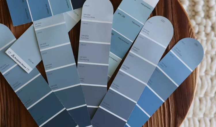
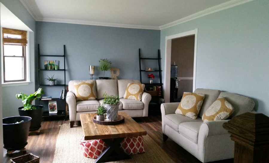
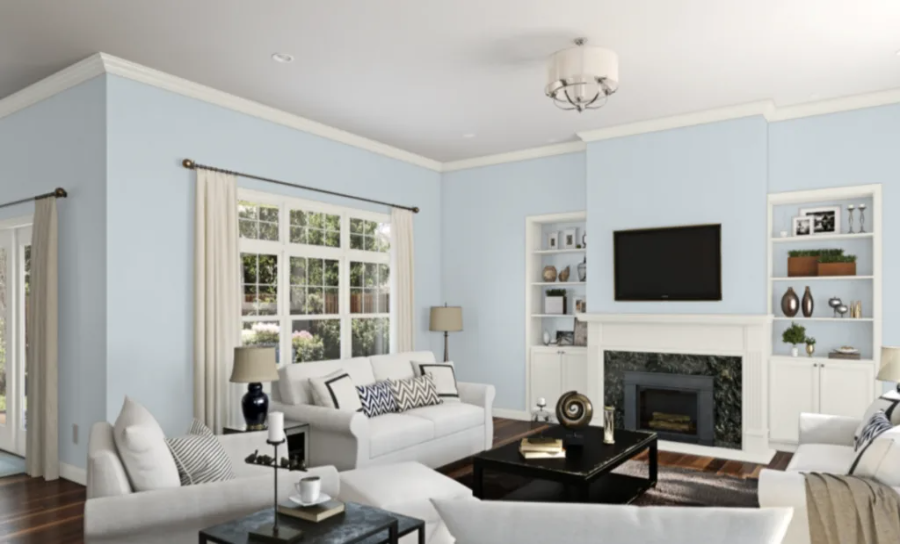
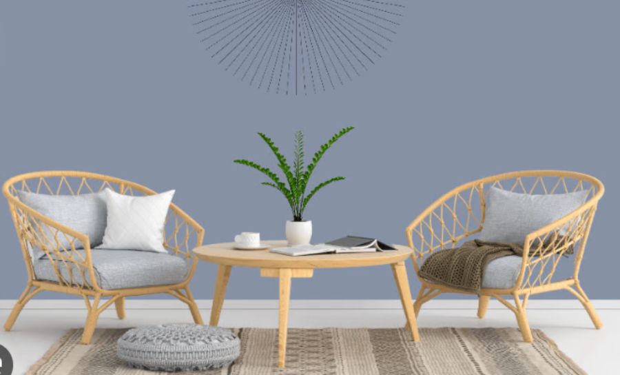
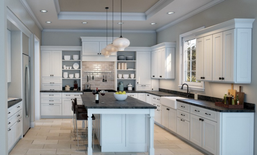
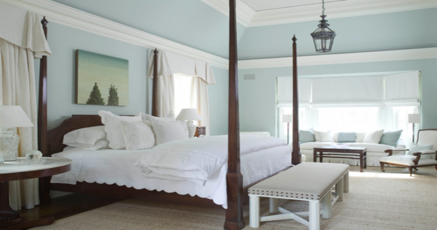
Are you looking to transform your house into a space of maximum comfort? If so, you have come to the right place. Today, we are going to explore the world of interior design. We are going to check out some gray-blue paint colors that can bring a calming, relaxing, and cool ambiance to your home. These tones are popular for creating a soothing atmosphere with a touch of sophistication.
The blue-gray combination comes in a wide range of options. From a lighter, ethereal shade to a deeper, moody tone. This ensures you find the perfect color combo to suit your style and preferences.
In this guide, we will look at 11 of the best gray-blue paint colors available. We have also mentioned coordinating colors and properties of the mentioned gray-blue tones. Now, let’s go through each shade in detail.
Why Choose Gray-Blue Tones?

A gray-blue hue is either a gray with strong blue overtones or a blue with strong gray undertones. If you compare the color sample with charcoal gray or deep navy blue, you will be able to detect the undertones of a hue.
Blue is a calming hue, but if it isn’t combined with gray tones, it might look childish or pastel. So when choosing a paint color for a home, a true blue gray will be tranquil, soothing, and adaptable. The blue-gray combo is the new range of pastel shades that are upcoming and trending.
Like any other combination, there are numerous shades in this color spectrum. These colors come with specifications that should not be ignored. One such important aspect is LRV (Light reflectance values). Understanding technical aspects like this will greatly help you select the right color.
Similar Post: A Complete Review of Sherwin Williams Modern Gray Paint Color
Best Blue-Gray Paint Colors to Try Now
1. Benjamin Moore Santorini Gray Blue Tone
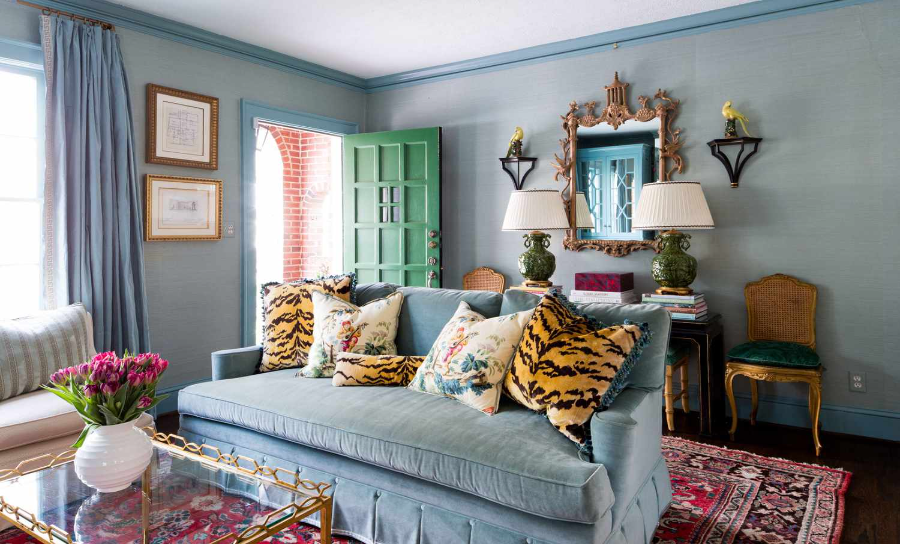
You will love Santorini Blue so much that you would like to use it somewhere in your house. Apart from walls, you can also use this color for kitchen islands, kitchen cabinets, built-in cabinets, and tray ceilings.
If you want to paint your walls with Santorini Blue, furniture or decor colored in shades of white and cream will go extremely well.
This hue also looks stunning when combined with bright white wainscoting. There is a gray undertone to this paint hue, which is unmistakably blue. However, a space with less natural light makes the gray side more noticeable.
LRV: 44.67
Coordinating Colours: Cloud White, White Sand, Distant Gray, and Wolf Gray.
2. Benjamin Moore Smoke
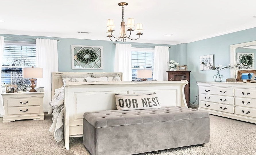
William Moore Smoke is a serene and understated blue-gray paint color that may give your room a fresh, airy feeling. This hue looks fantastic in contemporary, modern, and seaside home designs. This elegant gray is on the medium to light end of the spectrum.
This stunning, excellent option is light blue with a hint of cold gray. It seems neutral without being the standard white. With wooden furniture or doors and checkered floors, Smoke can help you give a vintage vibe to your living space.
LRV: 56.39
Coordinating Colours: Chantilly Lace, Steel Wool, Cloud Cover, Wind’s Breath
3. Gray Cashmere by Benjamin Moore
Given that both blue and green are conventionally chilly colors, a blue-gray with green is still a cool color. Green helps in softening the appearance of blue.
This addition of green won’t make your blue-gray any warmer, but it might appear a little more inviting than a blend of blue that is cooler.
Gray Cashmere is a mild combination of blue, gray, and green. It is popularly used in bathrooms and bedrooms for its relaxing vibe. We love how well the marble countertop is going with this color.
LRV: 64.53
Coordinating Colours: Storm Cloud Gray, Rainforest Drew, Flint, Mallard Green
4. Benjamin Moore’s Water Edge
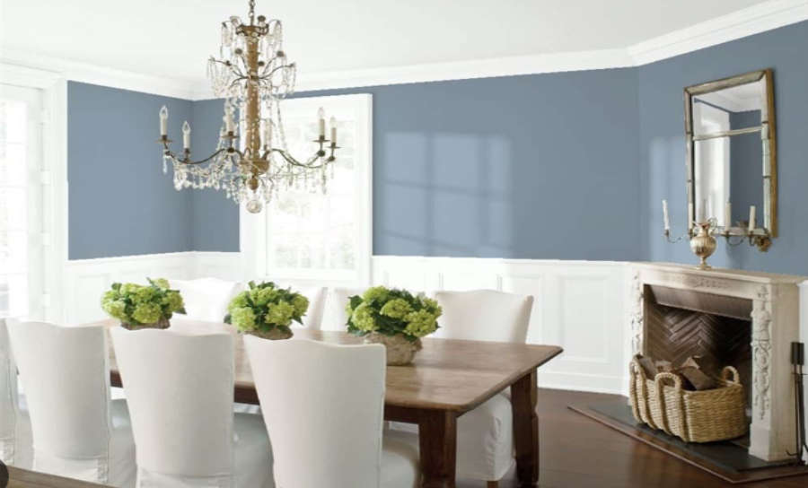
It’s wonderful to be in this dining area. With a brown wooden table and white chairs, Benjamin Moore’s Water’s Edge adds a lively flash of color while looking calming.
The natural pop of green plants is just the detail that this dining room needed. It is clear from the image that this color balances out the dark browns and bright whites, making the space look neutral.
This shade of gray prevents the blue from becoming overbearing. It would look lovely on cupboards or the walls of a bedroom.
LRV: 31.48
Coordinating Colours: Dove Wing, Antique Jade, Simply White, Natural Wicker
Also Read: 12 Easy Blue Couch Living Room Ideas to Transform Your Space
5. Sherwin William’s Gray Blue Outerspace
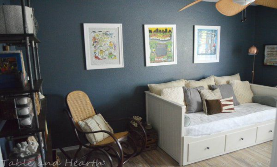
Outerspace can be used in any house room, especially as an accent. This shade inclines towards the darker side of the color spectrum.
It is an ideal color for spacious rooms as it absorbs more light and makes your walls appear closer. You can also use this color for spaces that feel empty or have high ceilings.
Metallic elements with gold brushed brass or chrome color can further elevate the appearance of a room painted with this blue-gray shade. We would advise you not to use this color on all the walls of your room, as outer space works best as an accent.
LRV: 12
Coordinating Colours: Quicksilver, Front Porch, Retreat, Mustard
6. Sherwin William’s Naval
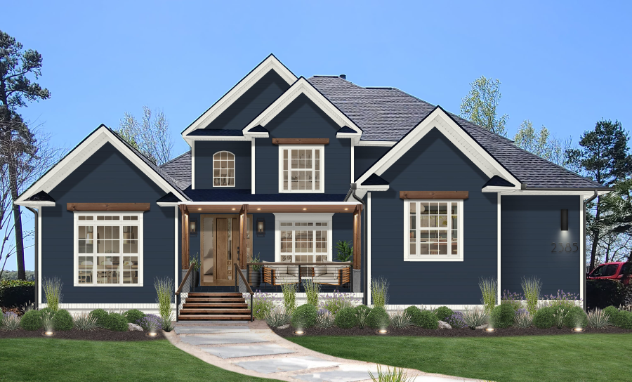
One of the top dark blue paint colors from Sherwin Williams, it conveys refinement, elegance, and the height of luxury.
This near-black shade is one of the interior designers’ favorites for house exteriors. It also looks fantastic on built-in shelves, focal walls, and kitchen cupboards where you want to add depth and texture.
The modern, mid-century, transitional period, and modern farmhouse design styles, as well as any climatic situation, may all benefit from applying this navy blue paint.
LRV: 4
Coordinating Colours: Icicle, Ramie, Roycroft Suede
7. Nimbus Gray by Benjamin Moore
One of those hues that entirely alters color depending on the time of day and the lighting in your home is nimbus gray. It may be overtly blue at times, melancholy gray at others, and occasionally even a bit of green.
I’m inclined to call this one a blue-green-gray instead! Though black elements go with almost every color, we particularly like how well it complements this color.
Remember not to mistake Nimbus Gray (2123-05) for Nimbus (1465). While the prior is blue with gray undertones, the latter looks like a more obvious gray.
LRV: 41.78
Coordinating Colours: White Ice, Stone Brown, Caliente, Pure White
8. Icy by Sherwin Williams
Icy, a light blue-gray, is one of my faves. This color is said to be flawless in coastal or beach-themed houses. If you want a soft, neutral blue, it’s ideal for bedrooms.
It might also give a spa-like feel in a bathroom. You avoid the baby blue effect by using the more sophisticated gray undertones.
Additionally, it is effective in dimly lit spaces as well as in general. With yellow-lighted bulbs or south-facing windows, this color might appear a little purplish. On the other hand, it looks very cold in north-facing rooms.
LRV: 56
Coordinating Colours: Rarified air, Modest white, Trusty tan
See More: A Complete Review of Repose Gray Sherwin Williams
9. Flower Box by Benjamin Moore
It seems logical that a blue-gray with a violet undertone would appear a little frigid, as purple is typically considered a cool color. Your blue will shift as you add purple, making it appear slightly colder.
The flower box is almost like a blue version of the Periwinkle color. However, it’s the gray that prevents it from looking too purple. Compared to gray-blue greens, which have a seaside feel, gray-blue with purple is frequently perceived as more romantic and subtly more conventional. However, it is not recommended as exterior paint.
It is found by the paint color consultants that requests for blue-gray with a green undertone much surpass those for blue-purple. Anyhow, we have added this blue-gray-purple shade for you to decide for yourself.
LRV: 28.94
Coordinating Colours: Ice Milk, Hidden Cove, White Heron, Intense White
10. Sherwin Williams’ North Star
A light yet vivid blue-gray paint hue called North Star brightens any space. This color is quite mischievous. Whether a person sees it as a blue color with a gray undertone or a gray color with a blue undertone depends highly on one’s perspective.
This is why it is suitable for both light and dark rooms. It will dial down the brightness of a light room and won’t appear too dark in the absence of light.
North Star is one of the best colors for a traditional-style home. Unlike many blue-gray combinations, North Star doesn’t have any green undertone.
LRV: 62
Coordinating Colours: Quicksilver, Alabaster, Cadet
11. Benjamin Moore’s Glass Slipper
You would certainly adore Benjamin Moore Glass Slipper in a space with lots of natural light. It is strongly advised to use this icy blue-gray paint color in rooms with south or west exposures since it might create a cold atmosphere.
Clear gray undertones in this blue give it a chilly touch. The more this color is exposed to light – the brighter and more cheerful it looks.
This color is bound to open your mind and get creative. It’s a white canvas on which you may experiment and have fun with colors. This makes Glass Slipper an ideal choice for kids’ rooms. Imagine a white crib in a nursery with walls painted with this color!
LRV: 70.2
Coordinating Colours: Oxford White, Blue Springs, Chantilly lace, Nightingale
Related: 21 Paint Colors for Living Room: Expert-Approved Color Picks
Can Lightings Affect Your Gray Blue Paint?
Due to the way paint colors are mixed, undertones may be found in every single paint color that is now available. As a result, how colors seem is affected by various lighting conditions.
Depending on the undertones, the color, and the temperature of the illumination, it occurs to varied degrees. Certain paint hues are more prone to change, and the blue-gray family of paints happens to have a particularly strong chameleon nature.
Warm-tinted illumination, such as that seen in the east in the morning and the west in the evening, as well as in incandescent and halogen light bulbs, intensifies warm tones and tames cooler ones.
However, cold-tinted illumination, such as fluorescent lighting and sunlight that faces north, will accentuate cool tones while muting warm tones.
You will see changes in blue-gray throughout the day as the light changes since it is a color changer. When lit with cold tones, blue-gray will seem deeper and grayer. On the other side, gray-blue will be brightened by warm lighting, making it look lighter and generally bluish.
Summing It Up
All in all, blue-gray paint colors have gained immense popularity due to their ability to create a serene and calming atmosphere while adding a touch of sophistication to any space. These colors effortlessly blend the calmness of blue with the timeless elegance of gray.
With a wide range of blue-gray paint colors available, it’s important to consider lighting conditions and the desired mood you want to create.
Different lighting can affect how these colors appear, so it’s essential to test samples in various lighting situations before making a final decision. After choosing a blue-gray paint color, the key is to find the hue that resonates with your style and enhances the overall aesthetic of your home.
Let us know in the comments which blue-gray shade could you resonate with the most.
Check This Next: Best Neutral Paint Colors (15+ Colors to Choose from)


